Accessibility used to be treated like an optional website upgrade. For most businesses, that mindset no longer works. If your site is difficult to navigate with a keyboard, hard to read on mobile, confusing for screen readers, or dependent on color alone to communicate important information, you're not just creating friction. You're losing leads, weakening trust, and making your marketing work harder than it should.
At SiteLiftMedia, we've seen this across redesigns, SEO campaigns, and website maintenance projects. A company invests in traffic through Las Vegas SEO, paid ads, social media marketing, or content expansion, then sends visitors to a site that quietly excludes part of the audience. Sometimes it's a menu that can't be tabbed through. Sometimes it's a booking form with unlabeled fields. Sometimes it's light gray text on white because it looked clean in a mockup. Small choices add up quickly.
Accessibility improvements are good for people, good for search visibility, and good for conversion rates. They also tend to improve code quality, page structure, mobile usability, and long-term maintainability. For businesses in competitive markets like Las Vegas, Nevada, those gains matter. Whether you're running a law firm, med spa, contractor site, ecommerce brand, or multi-location service business, an accessible website is part of modern web design, not a side feature.
Here are the accessibility improvements modern business websites should implement to improve usability, strengthen performance, and avoid hidden issues.
Why accessibility belongs in every serious web design project
Accessibility is about making your website usable for people with visual, auditory, motor, and cognitive differences. That includes visitors using screen readers, keyboard navigation, captions, larger text settings, voice control, and other assistive tools. It also includes people dealing with temporary limitations, bright sunlight on a phone screen, aging eyesight, a broken mouse, or a slow mobile connection.
Business owners often underestimate how many real-world scenarios fall under accessibility. A customer looking for emergency service on their phone while driving through Las Vegas. A patient trying to complete a form with voice input. A procurement manager reviewing your B2B site on a laptop without audio. A local search user who needs to find your address, hours, and contact options quickly. Accessibility is practical usability.
There are also clear business reasons to care:
- Better conversions: Clearer forms, stronger contrast, and easier navigation help more people complete actions.
- Stronger technical SEO: Clean heading structure, descriptive links, and meaningful image text support crawlability and context.
- Lower friction on mobile: Accessible design often overlaps with responsive design best practices.
- Reduced legal exposure: More organizations are paying attention to digital accessibility requirements and complaints.
- Improved brand trust: A site that feels easy and considerate usually feels more professional.
For companies competing in local markets, accessibility also strengthens your marketing foundation. You can invest in local SEO Las Vegas strategies, backlink building services, and ad campaigns, but if the page experience is frustrating, that traffic will not convert the way it should.
Use proper structure before worrying about visual polish
A surprising number of accessibility problems start with structure, not design. When a website is built with weak semantics, screen readers struggle, keyboard users get stuck, and search engines have a harder time understanding page hierarchy.
Use headings in a logical order
Every page should have a clear heading structure. Section titles should follow a real hierarchy, not just whatever size looks nice. When headings are skipped randomly or used only for styling, screen reader users lose context fast. It also weakens readability for everyone else. If your service pages, location pages, or blog content are important for SEO company Las Vegas search intent, clean structure matters for both accessibility and technical SEO.
Good heading use also makes content easier to scan. That is one reason article formatting affects usability and performance. Site owners who want cleaner content architecture should also review how structure impacts readability and conversions in proper article structure.
Make keyboard navigation work everywhere
If someone cannot use a mouse, can they still use your website? That is the test. Users should be able to move through menus, buttons, forms, popups, sliders, and checkout steps with a keyboard alone. Focus states need to be visible. If the active element is hidden or barely outlined, users have no idea where they are on the page.
Common failures we see include navigation menus that only open on hover, modal windows that trap focus, and carousels with controls that do not respond properly. These problems are especially common on templated builds and rushed redesigns.
Add skip links and landmarks
Skip links let keyboard and screen reader users jump past repeated navigation to the main content. They are small, but they make a major difference on content-heavy websites. Landmarks like header, nav, main, and footer also help assistive technologies interpret the layout. These are not flashy upgrades, but they are foundational.
Label forms clearly
Forms are where many businesses lose money. If your quote request, appointment form, consultation form, or checkout flow is not accessible, lead quality suffers. Every input should have a real label, not just placeholder text. Error messages should tell users exactly what needs to be fixed. Required fields should be identified in more than one way. If your site depends on forms to drive revenue, this is one of the highest-value fixes you can make.
Improve text readability and visual clarity
Some websites look modern in a design file but become difficult to use in the real world. Accessibility pushes design teams to make better decisions about clarity, spacing, hierarchy, and contrast.
Increase color contrast
Low-contrast text is one of the most common accessibility problems on business websites. Light gray body text, pale buttons, thin fonts, and image overlays often look polished in a mockup but fail under normal viewing conditions. Visitors on mobile devices, older screens, or in bright outdoor settings will struggle.
Contrast is especially important on service pages, pricing pages, and calls to action. If your core contact button blends into the background, that is not just an accessibility issue. It is a conversion issue.
Don't rely on color alone
If a form error is shown only in red, some users will miss it. If availability is shown only in green, some visitors may not catch it. Important messages need text, icons, or pattern changes in addition to color. This matters on booking systems, ecommerce product options, charts, reporting dashboards, and account areas.
Use readable text sizes and spacing
Body text should be easy to read without pinching and zooming. Line height, paragraph spacing, button padding, and margin consistency all affect how comfortable a site feels. Cramped layouts increase cognitive load. For businesses trying to look premium, readability is part of that premium experience.
Accessibility does not mean boring design. Strong custom web design can absolutely look refined while still being readable. In fact, many of the best-performing interfaces combine accessible spacing, clear hierarchy, and restrained visual choices. That is part of why thoughtful UX trends matter for lead generation and usability.
Reduce distracting motion
Auto-playing sliders, fast parallax effects, and animated elements that move as users scroll can create real barriers. Some motion causes discomfort. Other motion simply distracts from the task. If you use animation, it should support meaning, not compete with it. Users should also be able to pause or avoid motion when needed.
Make images, video, and downloadable content usable
Many business websites focus on visible page content while ignoring the supporting media around it. That creates major accessibility gaps.
Write alt text that actually describes the image's purpose
Alt text should help users understand what matters about an image. For decorative images, alt can be empty. For meaningful images, the description should reflect the context of the page. A headshot on an attorney page, a before-and-after project image, a product image, or a chart in a report all need different treatment.
Keyword stuffing alt text is not helpful. If you're trying to rank for web design Las Vegas, do not cram that phrase into every image. Use alt text to communicate useful meaning, not to game rankings.
Add captions and transcripts for video and audio
Video is everywhere now, from homepage intros to service explainers and customer testimonials. Captions help deaf and hard-of-hearing users, but they also help people watching with the sound off. That makes them valuable for usability and for content shared through social media marketing channels. Transcripts are also useful for long-form interviews, podcasts, webinars, and educational content.
Be careful with PDFs and downloadable files
Businesses often upload menus, brochures, reports, applications, forms, and capability statements as PDFs without checking accessibility. If that file is an image-based scan, missing tags, or hard to navigate, it may be unusable for some visitors. Whenever possible, key information should also exist as HTML on the website itself. HTML content is easier to read, easier to index, and easier to maintain.
Build mobile accessibility into local conversion paths
A modern business website has to work on phones first, especially for local intent. That is true for nationwide brands and even more true for businesses serving city-based searches in Nevada. When someone searches for a nearby service, they often need immediate answers: what you do, where you are, whether you're open, and how to contact you.
For Las Vegas businesses, that means accessibility has to be built into the mobile conversion path. A visitor searching after hours from the Strip, Summerlin, Henderson, or North Las Vegas is not going to fight through a difficult interface.
Use large enough tap targets
Buttons, links, phone icons, and navigation controls need enough size and spacing to be tapped accurately. Tiny links packed together create accidental clicks and frustration. This is especially common in mobile menus, filter panels, and footer navigation.
Keep local information easy to find
Your name, address, phone number, hours, and service area should be visible and readable. Maps should not be the only way to understand location details. Directions, parking notes, and office access information should be written out. For local SEO Las Vegas work, this also supports consistency and user trust.
Make click-to-call and booking tools accessible
Appointment widgets, quote calculators, and click-to-call buttons need to be tested on actual devices. We've seen too many third-party booking tools that fail keyboard access, use poor contrast, or hide labels behind fancy interactions. If your business depends on immediate inbound leads, these issues can quietly damage performance for months.
Site speed is part of the same mobile experience. Bloated pages, oversized scripts, and clunky plugins slow down interactions and increase abandonment. If performance is already a concern, it's worth reviewing why fast loading websites matter for Las Vegas businesses, especially when mobile traffic drives local lead flow.
Accessibility, SEO, and conversion performance are closely connected
Accessibility is not identical to SEO, but there is a lot of overlap. Clean page structure, descriptive anchor text, accessible navigation, mobile usability, and readable content all help search engines understand your site better. They also help people stay on the page long enough to take action.
Businesses sometimes separate these conversations too much. The SEO team talks about rankings. The design team talks about visuals. The developer talks about code. The owner talks about leads. In practice, the site performs best when all four line up.
For example:
- Descriptive links help users understand where a click goes and improve contextual relevance.
- Proper heading structure improves scanning for users and interpretation for crawlers.
- Alt text helps non-visual users and supports image context.
- Fast, stable pages reduce friction for everyone.
- Readable service content makes it easier to rank and easier to convert.
If you're investing in technical SEO, backlink building services, and content creation, accessibility helps those investments work harder. It also improves the experience after users land. That matters even more for service businesses targeting terms like SEO company Las Vegas or web design Las Vegas, where competition is high and trust signals carry weight.
Don't let security tools create access barriers
Security and accessibility should support each other, not conflict. This gets overlooked a lot. A site may have solid business website security but still create unnecessary barriers through bad implementations.
CAPTCHAs are a common example. Some are difficult for users with visual or cognitive limitations. Others fail badly on mobile. If your forms require aggressive challenge steps just to request a quote, you're creating avoidable friction. There are more user-friendly ways to handle spam prevention, rate limiting, and abuse detection.
Session timeouts, account lockouts, downloadable verification files, and portal access workflows also need accessibility review. Businesses in regulated industries or those handling sensitive data should absolutely invest in cybersecurity services, penetration testing, and strong operational controls. But those protections should be deployed in a way real users can still navigate.
At SiteLiftMedia, this is where broader infrastructure knowledge matters. Accessibility is not limited to front-end design. It touches website maintenance, form handling, hosting configuration, system administration, and server hardening. A secure site that users cannot successfully interact with is still underperforming.
Common accessibility mistakes we see on business website redesigns
When we audit older websites or rebuild underperforming ones, certain patterns show up again and again.
- Template-driven layouts with weak code structure
- Menus that work with a mouse but fail on keyboard
- Generic buttons labeled "Learn More" everywhere
- Forms with missing labels and vague errors
- Low-contrast text and ghost buttons
- Important content placed inside sliders or hidden tabs
- PDF-heavy pages with little accessible HTML content
- Auto-playing media without controls
- Plugin overload that creates conflicting behaviors
Cheap templates are often a major source of these issues. They may look efficient upfront, but they tend to create constraints that hurt usability, SEO, and long-term flexibility. If that sounds familiar, it's worth reading about the hidden problems with cheap website templates and how they affect real business sites.
WordPress sites can also drift into accessibility trouble when too many plugins control layout, forms, popups, and performance at the same time. Each plugin may solve one problem while creating three more. If your backend feels overloaded, this guide on improving a WordPress site with too many plugins is a practical place to start.
What a practical accessibility upgrade plan looks like
Accessibility does not require tearing down your entire website in every case. Sometimes it does point to a larger redesign, especially if the existing platform is rigid or outdated. But many businesses can make real progress with a focused improvement plan.
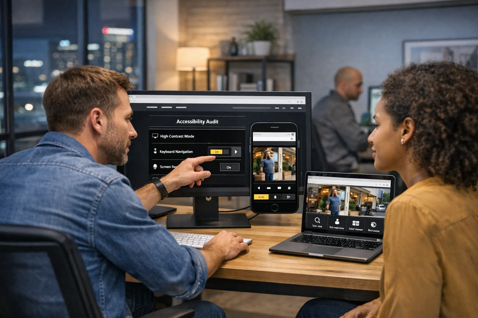
Start with an audit
Use automated scans, but do not stop there. Automated tools are useful for catching contrast issues, missing alt text, empty links, and structural problems. They do not replace human testing. Your site should also be checked with keyboard navigation, mobile devices, screen readers where appropriate, and real user pathways like contact forms, scheduling, login, and checkout.
Prioritize high-impact pages
Start with the pages that matter most to revenue and visibility:
- Homepage
- Main service pages
- Location pages
- Lead forms
- Booking and checkout flows
- Blog templates
- Contact and about pages
This is usually where businesses see the fastest return.
Fix the shared components first
Navigation, headers, footers, buttons, form elements, and content templates are used sitewide. Improving those components can lift accessibility across dozens or hundreds of pages at once. That is one reason custom web design often outperforms heavily patched templates over time. Cleaner systems are easier to update consistently.
Build accessibility into content workflows
Even a well-built site can decline if content teams are not trained to maintain standards. New blog posts should use heading structure correctly. Images should get proper alt text. PDFs should be reviewed before upload. Landing pages should avoid poor contrast and vague link text. Accessibility needs to become part of publishing, not just development.
Keep it part of ongoing maintenance
Sites change constantly. Plugins update. New content gets added. Third-party widgets change behavior. Marketing teams launch seasonal campaigns. Redesign planning, campaign rollouts, and infrastructure cleanup are exactly when accessibility can either improve or quietly break. Ongoing website maintenance should include accessibility checks as part of normal QA.
If your business is planning a redesign, expanding content, or cleaning up an aging platform, SiteLiftMedia can audit the current site, identify the accessibility issues affecting usability and search performance, and build a stronger path forward. Whether you need web design Las Vegas support, technical SEO cleanup, security-minded development, or a broader digital growth strategy, contact SiteLiftMedia to find the biggest wins first.
Photo Gallery