Many business websites struggle with engagement for a simple reason. They have the right information, but it is presented in the wrong order, with the wrong emphasis, or with too many competing distractions. Visitors land on the page, scan for a few seconds, and leave without taking action.
That is where content layout and visual hierarchy make a measurable difference. They help people understand what a page is about, where to look next, and what action to take. Done well, they reduce friction, improve trust, and create a smoother path from first impression to conversion.
For business owners and marketing managers, this matters far beyond aesthetics. Strong layout choices affect bounce rate, time on site, lead quality, sales inquiries, and organic visibility. In competitive markets like Las Vegas, where users compare multiple vendors quickly, a cleaner and more intentional website experience can become a real growth advantage.
At SiteLiftMedia, we see this often with companies investing in Las Vegas SEO, paid traffic, local SEO Las Vegas campaigns, and custom web design. They may already be spending on visibility, but if the website does not guide attention well, those clicks do not convert as efficiently as they should. Good design is not just decoration. It is a performance tool.
Why engagement starts with what visitors see first
People do not read websites in a neat top to bottom pattern. They scan. They look for relevance, clarity, and trust signals in seconds. That means your layout must answer a few questions immediately.
- What does this business do?
- Is this page relevant to my need?
- Can I trust this company?
- What should I do next?
Visual hierarchy is the system that helps answer those questions fast. It uses size, spacing, contrast, placement, and grouping to tell the visitor what matters most. A clear headline, a supporting subheading, a visible call to action, and well organized supporting content all work together to keep users moving instead of bouncing.
On a business website, this first impression is critical. A law firm, medical clinic, contractor, ecommerce brand, or B2B service company only gets a short window to create confidence. If key information is buried, the page feels overwhelming, or important actions are hard to find, users disengage. Even a strong offer can underperform when the page is visually confusing.
The hidden business cost of poor layout
Bad layout is expensive because it wastes the attention you already paid to earn. Whether traffic comes from Google, PPC, email, referrals, social media marketing, or backlink building services, visitors still need a page that feels easy to use.
Common layout problems include long walls of text, too many equal sized headings, weak contrast, poor mobile spacing, cluttered navigation, and multiple calls to action competing in the same section. These issues create hesitation. Hesitation lowers engagement.
For a company trying to rank in a crowded market like web design Las Vegas or SEO company Las Vegas searches, weak engagement also creates secondary problems. Visitors spend less time on the page, interact with fewer elements, and are less likely to contact the business. While layout alone is not an SEO trick, strong user experience supports the broader goals of technical SEO, content performance, and conversion optimization.
In practical terms, poor layout can lead to:
- Higher bounce rates
- Lower lead form completion
- Reduced call volume
- More wasted ad spend
- Weaker trust in your brand
- Lower return on SEO and content investment
That is why layout decisions should be treated as business decisions, not just visual preferences.
The core principles of visual hierarchy that improve engagement
Start with a clear primary message
Every important page should have one dominant message at the top. Not three. Not six. The headline should communicate the page purpose clearly, and the supporting copy should reinforce the benefit to the visitor. If someone lands on a service page, they should instantly know what you offer, who it is for, and what result it helps deliver.
This is especially important for homepages and high intent landing pages. Businesses often try to say too much too early. A focused opening section performs better because it reduces cognitive load and gives users a reason to keep scrolling.
Use spacing to create clarity
White space is not wasted space. It improves comprehension by separating ideas and helping users scan sections quickly. When related elements are grouped together and given room to breathe, the page feels more organized and more professional.
Good spacing is one of the fastest ways to improve readability without changing the actual message. It can make a modest site feel more premium and more trustworthy.
Make headings do real work
Strong headings create a visual map for the reader. They break the page into meaningful sections, support skimming behavior, and guide users deeper into the content. This matters for both engagement and SEO. SiteLiftMedia recently explained why article structure drives SEO, readability, and sales, and the same principle applies across service pages and landing pages.
When headings are specific and benefit driven, users are more likely to keep reading. Generic labels like Services or About Us are less effective than headings that speak directly to outcomes, process, or expertise.
Create a clear call to action hierarchy
Not every button should have equal visual weight. If your primary goal is to get consultation requests, that call to action should stand out more than secondary actions like reading a blog post or viewing a gallery. One page can support multiple actions, but one should still be visually primary.
This is where contrast, button styling, placement, and repetition matter. A great call to action is not only visible once at the top. It appears again at the right moments throughout the page.
How better layout increases conversions
Engagement is valuable, but business owners care about outcomes. The reason content layout and visual hierarchy matter is that they directly support conversion behavior.
Think of a visitor journey on a business website. Someone arrives from a Google search, scans the hero section, checks a few proof points, reviews the service summary, and decides whether to contact you. If the page is well structured, that process feels natural. If the page is disorganized, the visitor has to work harder to understand what you do and why they should trust you.
High performing pages usually move in a logical sequence:
- Clear opening message
- Short statement of value
- Proof of credibility
- Simple explanation of services or solutions
- Objection handling
- Strong call to action
This is one reason custom web design often outperforms cookie cutter templates. Templates can look attractive, but many are built around visual novelty rather than conversion clarity. A business website should be designed around actual user behavior, sales goals, and search intent.
For example, a local service business in Nevada might need a faster path to phone calls and quote requests, while a nationwide B2B company may need a more educational flow with deeper service details. The right hierarchy depends on the audience, but the underlying rule stays the same. Make the next step obvious.
Layout and SEO work better together than most businesses realize
Content layout does not replace SEO, but it makes your SEO investment work harder. Pages that are easier to scan and understand often support stronger engagement signals and improved usability across devices. They also help search engines interpret page structure more effectively.
Some of the most useful layout decisions also support technical SEO and on page performance:
- Clear heading structure
- Logical internal linking
- Focused keyword placement in high visibility areas
- Readable paragraph length
- Mobile friendly spacing and tap targets
- Fast loading visual assets
If your site needs performance gains without a full rebuild, there are often meaningful wins available through structure and page refinement alone. SiteLiftMedia covered several examples in this article on on page SEO improvements that lift rankings without redesign.
For companies targeting Las Vegas SEO or broader statewide and national search terms, good layout also helps pages better match intent. A visitor searching for a service in Las Vegas expects immediate relevance, local credibility, and an easy next action. A cluttered page weakens all three.
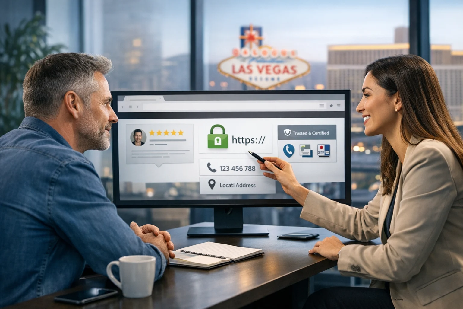
What strong visual hierarchy looks like for Las Vegas businesses
Las Vegas is an especially competitive market because users have options and move quickly. Whether your company serves hospitality, healthcare, real estate, legal, home services, nightlife, events, or B2B sectors, local visitors often compare businesses fast. Your website needs to communicate local relevance without feeling forced.
That means your most important local pages should make these elements easy to find:
- Primary services
- Las Vegas service area language
- Phone number and contact options
- Reviews or trust indicators
- Photos, examples, or proof of work
- Clear explanation of what makes your company different
For local SEO Las Vegas campaigns, layout is also important because it affects how well users engage with location pages. A city page should not just stuff the location name into every paragraph. It should present useful local context, clear service information, and obvious conversion points. This is especially important if you want stronger visibility in organic results and local packs. For businesses focused on maps visibility, this guide on improving Map Pack rankings in Las Vegas is a helpful companion to better local page design.
Nationwide companies can apply the same principle by building pages that balance broad brand authority with local relevance. You do not have to choose between serving national audiences and performing well in Las Vegas. You need the right content architecture to support both.
Mobile layout is now the main experience
Many business websites are still reviewed on large desktop screens first, but a major share of real traffic comes from phones. That changes how content should be prioritized. Mobile users have less screen space, less patience, and more distractions. If your visual hierarchy does not hold up on mobile, engagement drops fast.
Mobile friendly layout means:
- Shorter sections near the top
- Readable text sizes
- Buttons that are easy to tap
- Navigation that stays simple
- Forms that do not feel tedious
- Fast access to calls, directions, or booking
For Las Vegas businesses, mobile usability can be even more important because many users are on the go. They may be searching from a hotel, job site, office, conference venue, or neighborhood nearby. If your page makes them pinch, scroll endlessly, or hunt for contact details, they will often move to a competitor.
A smart mobile layout does not just shrink desktop content. It reorders information based on what matters most on a smaller screen.
Trust is shaped by design, performance, and security together
Visual hierarchy helps guide attention, but engagement also depends on whether the site feels safe, current, and reliable. If a business website loads slowly, shows broken elements, or triggers browser warnings, users lose confidence no matter how polished the design is.
This is where web design overlaps with website maintenance, business website security, and infrastructure health. A polished page experience should be backed by stable hosting, consistent updates, and strong operational support. That can include system administration, server hardening, secure backups, and regular checks for vulnerabilities.
For companies collecting leads, processing sensitive information, or running on popular CMS platforms, cybersecurity services and penetration testing can play a direct role in user trust. A secure form experience, valid SSL, current plugins, and strong patch management all protect the credibility your design is trying to build. SiteLiftMedia also covered why patch management matters for website security, which is especially relevant for businesses planning a website refresh or Q1 hardening project.
In other words, visual hierarchy gets users moving, but performance and security help keep them there.
Elements every high performing business page should include
If you are evaluating your current site, here are the elements most pages should have to improve engagement:
- A direct headline that explains the offer or service clearly
- A subheading that communicates value or outcome
- A primary call to action placed high on the page
- Trust indicators such as reviews, certifications, client logos, or years in business
- Organized service sections with clear visual separation
- Scannable copy with short paragraphs and meaningful headings
- Mobile friendly layout with fast access to contact options
- Relevant internal links that support next steps without distracting from conversion
- Technical stability through maintenance, monitoring, and security practices
These are not complicated ideas, but execution matters. The exact order, wording, and design treatment should reflect your buyer journey and business goals.
When it is time to improve layout without waiting for a full redesign
Not every company needs a full rebuild right away. Sometimes the biggest engagement gains come from reworking page structure, simplifying navigation, improving headings, updating calls to action, and tightening content flow. That can be an ideal approach during annual planning, before a major campaign launch, or as part of Q1 growth strategies.
This is particularly valuable if you are already investing in Las Vegas SEO, backlink building services, social media marketing, or paid ads. Better page layout helps all of those channels convert more effectively. It also creates a stronger foundation for future growth, whether that means a full custom web design project later or deeper technical SEO work now.
For some businesses, a refresh may also be the right time to address outdated templates, mobile issues, load speed concerns, or hidden risk areas connected to hosting and security. A website should not only look current. It should support marketing performance and operational reliability at the same time.
Why businesses choose SiteLiftMedia for web design that performs
At SiteLiftMedia, web design is not treated as isolated visuals. It is connected to search visibility, content strategy, usability, speed, security, and long term growth. That matters when business owners want more than a prettier website. They want a site that supports leads, sales, and stronger digital performance.
Our team works with businesses in Las Vegas and across the country that need practical improvements with measurable impact. That may include custom web design, local SEO Las Vegas strategy, technical SEO, conversion focused page structure, website maintenance, cybersecurity services, server hardening, and broader digital growth planning. The goal is simple. Build websites that are easier to use, easier to trust, and easier to turn into revenue.
If your current site feels cluttered, underperforming, or out of sync with your marketing goals, content layout and visual hierarchy are smart places to start. Small structural changes can produce meaningful improvements in engagement. Larger redesigns can unlock even more when the strategy is right.
Ready to improve how your website guides attention and converts visitors? Contact SiteLiftMedia to review your current site, identify layout and hierarchy issues, and build a stronger web experience for Las Vegas customers and nationwide audiences alike.
Photo Gallery