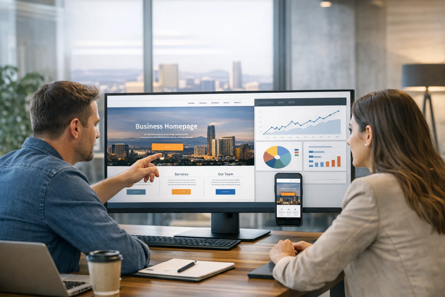
Your homepage does a lot of important work. It shapes first impressions, supports SEO, answers quick questions, and nudges visitors toward action. If it is poorly structured, slow, vague, or visually confusing, conversion rates often suffer long before anyone questions the traffic source.
At SiteLiftMedia, we have seen this happen across industries. A company can invest in Las Vegas SEO, PPC, social media marketing, backlink building services, and technical SEO, but if the homepage does not clearly communicate value and guide the next step, too many qualified visitors leave without calling, booking, or filling out a form.
That matters even more in competitive markets like Las Vegas, where users often compare several providers within minutes. Whether someone is looking for a web design Las Vegas agency, a local service business, a legal office, a medical practice, or a B2B provider, the homepage often determines whether that visitor keeps going or bounces.
This goes beyond design alone. It affects revenue. A homepage that converts well helps every marketing channel perform better, from local SEO Las Vegas campaigns to paid traffic, referral traffic, email, and direct brand searches.
Here is how homepage design can improve conversion rates, and what business owners and marketing teams should focus on when reviewing their own site.
Your homepage is not just a welcome page
Many companies still treat the homepage like a digital brochure. It looks polished, says a few broad things about the business, and leaves visitors to figure out the rest. That approach wastes momentum.
A high-performing homepage should act more like a guided decision tool. It should help a new visitor answer a few critical questions quickly:
- What does this business do?
- Is it relevant to my need?
- Can I trust this company?
- What should I do next?
If those answers are delayed, buried, or scattered across the page, conversion friction goes up. We often see this on websites that prioritize visual style over clarity. Strong branding matters, but it cannot replace direct messaging and thoughtful structure.
For businesses focused on growth, especially during annual planning or Q1 growth strategy reviews, the homepage should be treated as a conversion asset. It is one of the highest-leverage pages on the site, and even modest improvements can lift lead volume without increasing ad spend.
Clear above the fold messaging increases action
The top section of the homepage is where many conversion wins start. People make fast judgments. Within a few seconds, they want to know whether they are in the right place. If the hero section leans on vague taglines, stock phrases, or oversized visuals with no clear offer, visitors have to work too hard.
The strongest homepages usually include a simple combination:
- A clear headline that explains what the business offers
- A supporting subheadline that shows who it helps and why it is different
- A primary call to action that matches buying intent
- A visual that reinforces credibility instead of distracting from it
For example, a Las Vegas service business should not rely on a headline that says something generic like “Innovative Solutions for Modern Growth.” It may sound polished, but it says very little. A better message states the actual service, target market, and business outcome.
If you are a company targeting both local and national traffic, the homepage also needs to balance reach with specificity. We often recommend language that supports nationwide service capability while still reinforcing local relevance for Nevada searchers. That can help support searches tied to terms like SEO company Las Vegas, custom web design, or local SEO Las Vegas without making the content feel forced.
When a homepage immediately clarifies the offer, more visitors keep scrolling, and more of them click into service pages, contact forms, or calls.
Good visual hierarchy keeps users moving
Conversion rates improve when pages are easy to scan. Most homepage visitors do not read every line from top to bottom. They scan headlines, compare sections, and look for confirmation that they are making a smart choice.
That is why visual hierarchy matters. The page should naturally guide attention from the most important message to the next logical proof point and then toward a conversion action. This is not about flashy tricks. It is about removing hesitation.
Strong hierarchy often depends on:
- Thoughtful spacing
- Readable headline sizing
- Clear contrast between sections
- Buttons that stand out without overwhelming the design
- Logical ordering of content blocks
One common issue we see is equal visual weight everywhere. If the hero, service overview, testimonials, certifications, and blog feed all compete for attention, the page feels noisy. Users stop scanning with purpose and start wandering.
A cleaner structure makes the next step obvious. On some homepages, that next step is a contact form. On others, it may be a phone call, a quote request, a booking action, or a click into a priority service page.
If your site needs better mobile behavior as part of that process, this guide on responsive web design tactics that improve SEO and conversions is a useful companion.
Trust signals reduce hesitation fast
People do not convert based on design alone. They convert when the design supports trust.
Your homepage should quickly show visitors that the business is legitimate, experienced, and safe to contact. This is especially important for high-value services, regulated industries, and competitive local markets where users may compare several vendors in one session.
Trust signals can include:
- Client logos
- Review highlights
- Case study references
- Industry certifications
- Awards or recognitions
- Years in business
- Short proof statements with real results
- Visible contact information
Placement matters. These signals should appear early enough to support confidence, not buried near the footer where only the most committed visitors see them.
For Las Vegas businesses, local proof is often a major conversion factor. Mentioning work with Nevada clients, showcasing local testimonials, or referencing regional market knowledge can help visitors feel that the company understands the pace and competition of the area.
That said, trust is not only about badges and logos. Tone matters too. Overwritten marketing language can weaken credibility just as much as weak design. A homepage should sound confident and specific, not exaggerated.
If you want to strengthen this area, SiteLiftMedia has covered practical ways to improve website trust signals and visual credibility without cluttering the page.
Calls to action should match real buyer intent
One of the biggest reasons homepages underperform is that the call to action does not fit the visitor's stage of decision-making.
A person ready to buy may want to request a quote now. Another visitor may still need to compare services, view proof, or ask a few questions. If the homepage offers only one aggressive CTA, some users will disengage.
High-converting homepages usually combine a strong primary CTA with one or two supporting options. Examples include:
- Primary CTA: Request a consultation
- Secondary CTA: View services
- Support CTA: Call now or see recent work
The wording matters. “Learn More” is often too weak. “Get a Free Audit,” “Book a Discovery Call,” or “Request Website Pricing” gives users more clarity and usually performs better because they understand exactly what happens next.
For lead generation websites, button placement throughout the homepage also matters. A single CTA at the top is rarely enough. Strategic repetition, especially after trust sections or service summaries, gives users a chance to act when confidence rises.
Homepage content should answer objections before they stall the lead
Good homepage design is not just about aesthetics and layout. It is also about sequencing information to address common concerns.
Think about what a prospect may be wondering in the first minute:
- Do they work with businesses like mine?
- What makes them different from competitors?
- Are they local or nationwide?
- How fast can they start?
- Is their process clear?
- Can I trust them with my website, marketing, or data?
Your homepage should answer those questions naturally, not with walls of text, but with carefully chosen sections.
For example, if your business offers web design, SEO, PPC, website maintenance, or custom development, the homepage should make it clear whether you handle strategy, implementation, reporting, and ongoing support. If you also provide cybersecurity services, penetration testing, business website security, system administration, or server hardening, those capabilities can become major trust builders when they are presented clearly.
Many decision-makers are tired of agencies that only make sites look better while ignoring performance, security, and long-term maintenance. A homepage that shows broader operational competence can increase conversions because it reduces the fear of future problems.
Mobile speed and usability have a direct conversion impact
Most business websites now see a large share of traffic from mobile devices. In local search, that share can be even higher. A homepage that looks great on desktop but feels clumsy on mobile will quietly lose leads.
Common mobile conversion issues include:
- Slow loading hero images
- Oversized banners that push key content too far down
- Small tap targets
- Crowded navigation menus
- Forms that are hard to complete on a phone
- Sticky elements that block content
Page speed also affects perception. People connect speed with professionalism. A fast, responsive homepage feels more credible and easier to trust. That helps conversions before the user reads a single proof point.
From an SEO standpoint, mobile usability and speed support rankings as well. Stronger rankings bring more qualified traffic, and qualified traffic converts better when the homepage experience is smooth. That is where web design, technical SEO, and conversion strategy come together.
For businesses investing in local visibility, especially in competitive categories tied to Las Vegas SEO and web design Las Vegas searches, homepage performance can influence both search visibility and lead quality.
Navigation should simplify decisions, not multiply them
Navigation has a major impact on conversion, especially for first-time visitors. Too many choices create hesitation. Too few create confusion.
A homepage should offer a clear path into the services and pages that support commercial intent. If the main menu is overloaded with dropdowns, duplicate links, or vague labels, users slow down. If it is too sparse, they may not find the content that would have convinced them.
We usually recommend organizing navigation around the pages people actually need to make a buying decision:
- Core services
- Industries or solutions if relevant
- About or team credibility
- Work, case studies, or results
- Contact or consultation page
Homepage sections should reinforce that path. A visitor should be able to scroll and either convert directly or move into a relevant service page without friction.
This matters for multi-service agencies in particular. If a business offers web design, SEO, app development, PPC, website maintenance, cybersecurity services, and system administration, the homepage has to introduce that range without overwhelming the visitor. Clear categorization solves much of that friction.
Forms and lead capture elements should feel easy, not risky
Many homepage designs lose conversions at the exact moment the user is ready to act. The form is too long, too intrusive, or too vague. That creates unnecessary resistance.
Better homepage lead capture follows a few basic rules:
- Ask only for essential information
- Explain what happens after submission
- Use a button label with a clear promise
- Reduce anxiety around spam and privacy
- Place forms near relevant trust signals
If the homepage includes a short lead form, it should feel like a low-friction first step, not a commitment trap. For many businesses, fewer fields produce more leads. In some cases, a short form combined with qualifying follow-up questions later in the process creates far better conversion performance.
SiteLiftMedia recently covered how better form design drives more qualified leads, and the same principles apply directly to homepage inquiries.
SEO and conversion design should support each other
Some teams still separate SEO from design as if they belong to different projects. In practice, the best homepages do both jobs together.
A homepage can support search performance by using strong page structure, clear topical relevance, meaningful internal linking, useful content blocks, and fast technical performance. At the same time, it can improve conversion rates by guiding the visitor toward a contact action or a deeper service page.
For a business trying to rank for phrases related to SEO company Las Vegas, local SEO Las Vegas, or custom web design, the homepage should not read like a keyword dump. It should naturally reflect expertise, location relevance, and service clarity.
That means:
- Using headings that align with what users actually search for
- Explaining services in plain English
- Including local signals where appropriate
- Linking to deeper service or insight pages naturally
- Avoiding fluff that dilutes relevance
If your current homepage feels too broad, it may be time to rethink the structure. This article on planning a conversion focused website redesign in Las Vegas can help frame that review.
Security and maintenance affect conversion more than many teams realize
Business owners often think of security as an IT issue rather than a conversion issue. In reality, visitors are sensitive to anything that makes a site feel outdated, broken, or unsafe. Browser warnings, mixed content issues, buggy forms, poor uptime, or suspicious behavior can destroy trust instantly.
That is why homepage performance is tied to website maintenance and infrastructure quality. If the site is not maintained properly, design improvements alone will not hold their value.
For companies handling leads, transactions, sensitive customer data, or even just important contact inquiries, visible professionalism matters. Secure hosting, updated plugins, sound system administration, and proactive server hardening all contribute to a more stable website experience. The cleaner and more reliable the experience, the more likely users are to convert.
For some organizations, especially those comparing agencies, it is also reassuring to know that the same partner helping with custom web design understands broader business website security, cybersecurity services, and penetration testing. That cross-functional strength often becomes a deciding factor during vendor selection.
When a homepage redesign is worth the investment
Not every homepage issue requires a full rebuild. Sometimes stronger copy, better CTA placement, and a cleaner layout are enough. But there are clear signs that a larger redesign may be the smarter move:
- The homepage does not reflect current services or positioning
- Traffic is steady but lead volume is weak
- Mobile performance is poor
- The site feels dated compared to competitors
- Important trust signals are missing
- Users are bouncing before reaching key service pages
- The business has added new priorities like SEO, PPC, app development, or security support
We often see redesign projects tied to major business milestones such as a rebrand, market expansion, annual planning, or Q1 growth targets. A homepage refresh can be one of the highest-impact updates because it influences nearly every traffic source at once.
The best redesigns are not driven by trends alone. They are shaped by conversion goals, user behavior, search intent, and operational realities. That includes what your sales team hears on calls, what your analytics show, and where your current site is creating friction.
If your homepage is attracting traffic but not turning enough of it into real opportunities, SiteLiftMedia can help you identify what is holding it back and what to fix first. From custom web design and Las Vegas SEO to website maintenance, cybersecurity services, and growth-focused strategy, we build websites that are designed to do more than look good. If you want a homepage that earns more calls, form fills, and qualified leads, contact SiteLiftMedia and let’s review what your current site is really doing for your business.
Photo Gallery