Centering elements in CSS sounds simple until you need to do it on a live website with real content, real devices, and real business goals tied to the layout. A button that looks fine on desktop can shift awkwardly on mobile. A hero headline can appear centered but still feel off because the container is wrong. A modal can look perfect in one browser and drift in another if the centering method is outdated or overcomplicated.
That’s why this matters more than most people expect. For business owners and marketing teams, layout problems are not just developer annoyances. They affect trust, readability, lead generation, and conversion rates. If your site is built for growth, every section should feel intentional. That includes simple things like keeping a call to action button centered, aligning promo blocks, or placing a headline exactly where users expect it.
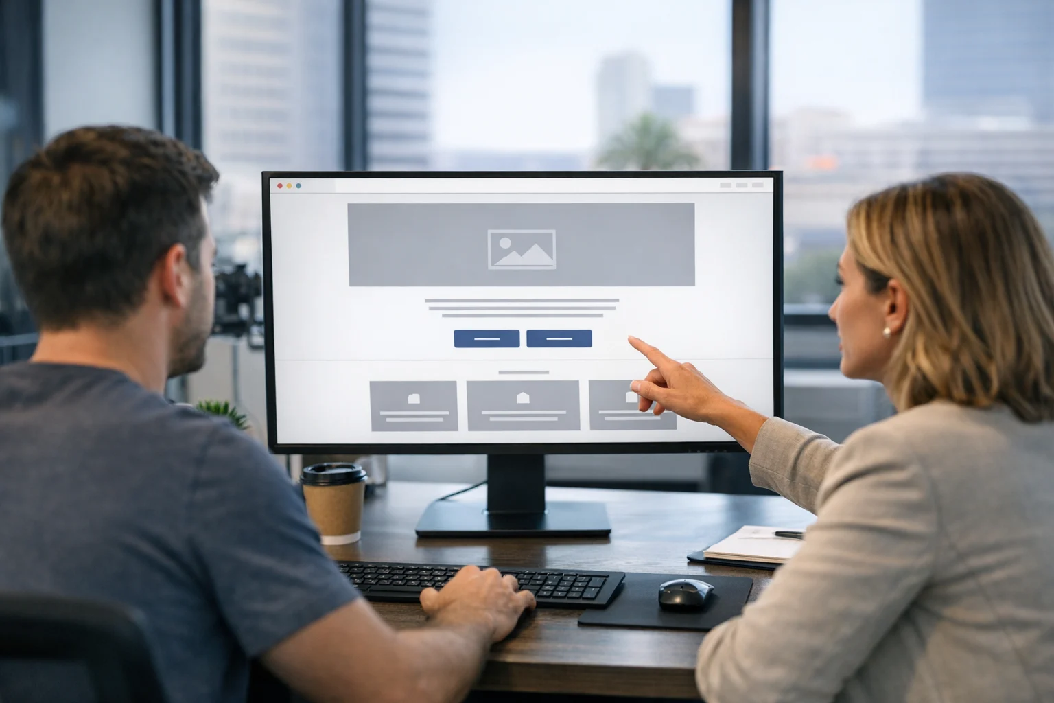
At SiteLiftMedia, we’ve worked with companies that needed stronger front end performance, cleaner custom web design, better mobile usability, and tighter technical SEO. Many of those improvements start with the basics. CSS centering is one of them. When it’s handled the right way, layouts become more stable, more responsive, and much easier to maintain.
If you’re managing a website for a company in Nevada, especially in a competitive market like Las Vegas, these details matter even more. Strong web design Las Vegas businesses rely on is not just about visual style. It’s about clarity, speed, and structure. The same goes for Las Vegas SEO and local SEO Las Vegas campaigns. Search visibility gets attention, but the page still has to convert once people arrive.
Why centering in CSS gets confusing
There isn’t just one kind of centering. That’s where people get tripped up.
You might need to center text inside a block. You might need to center a button horizontally within a section. You might need to center an image both horizontally and vertically inside a card. Or you may need to center an entire content block in the middle of the screen.
Each case is a little different because CSS works on both the element and its container. In other words, the question usually is not just, “How do I center this item?” A better question is, “What kind of element is this, what is its parent doing, and do I need horizontal centering, vertical centering, or both?”
Once you understand that, the easiest methods become much clearer.
The easiest way to center most elements today
If you want the shortest practical answer, it’s this: use Flexbox for most centering jobs.
Flexbox is the easiest modern method because it works well with buttons, text groups, icons, cards, hero content, and full sections. It’s flexible, readable, and far less frustrating than older hacks.
To center something horizontally with Flexbox
Set the parent container to display: flex; and then use justify-content: center;.
This is perfect for centering a single button, a group of links, or a row of content inside a wrapper.
To center something vertically with Flexbox
Set the parent to display: flex; and use align-items: center;.
This works well when you have a fixed height area like a banner, card, or callout section.
To center both horizontally and vertically
Use display: flex;, justify-content: center;, and align-items: center; together.
That’s the go-to solution for centered hero text, login forms, modal windows, and empty state messages.
For most websites, especially marketing sites and lead generation pages, this is the easiest method to remember and one of the easiest for future developers to maintain.
When Grid is even better
CSS Grid is another strong option, especially when you want a simple one-line centering method.
If the parent uses display: grid;, you can often center a child with place-items: center;.
That’s a clean solution when one element needs to sit in the center of an area. It’s especially useful in modern landing pages, featured image blocks, and interface components.
Grid is also a smart choice when the layout is already grid-based. If you’re building complex sections with multiple columns and rows, Grid can keep the centering logic consistent across the design.
In practice, Flexbox is still the first choice for many quick centering tasks, but Grid is just as valid. The best method is usually the one that matches the rest of the section instead of forcing a different layout system into the page.
How to center text the easy way
Text is one of the simplest cases. If you only need to center inline text inside a block-level container, use text-align: center; on the parent.
This works well for:
- Headlines
- Paragraphs in hero sections
- Navigation links
- Button text
- Captions
Where people get confused is assuming text-align: center; will center everything. It won’t. It centers inline content and inline-level children, not every block element on the page.
If your button or image is behaving like a block-level element, you’ll usually need a different method such as Flexbox or auto margins.
How to center block elements with auto margins
There’s another classic that still works well: margin: 0 auto;.
This method is ideal when:
- The element is block-level
- It has a defined width or max-width
- You want it centered horizontally inside its container
For example, many content wrappers are centered this way. A layout might have a container with a max-width and auto left and right margins so the content sits neatly in the middle of the page.
This is one of the most useful patterns on business websites because it keeps long lines of text readable and helps sections feel polished. It’s common in service pages, blog layouts, quote forms, and conversion pages.
When SiteLiftMedia works on website maintenance or front end cleanup, we often see older sites using unnecessary positioning tricks for something that should simply be a centered container with auto margins and a sensible max-width.
How to center images properly
Images can be tricky because the right method depends on how the image is displayed.
If the image is inline or inline-block
You can center it by applying text-align: center; to the parent.
If the image is display block
Use margin-left: auto; and margin-right: auto;. You can shorthand that as margin: 0 auto;.
This is one of the easiest fixes for logos, featured images, and badges that need to sit cleanly in the center of a section.
If the image needs to sit in the center of a card or box
Use Flexbox or Grid on the container. That gives you much better control when the image height varies or the surrounding content changes.
This matters on product pages, team pages, and service grids. If you’re running paid campaigns or seasonal promotions, inconsistent image alignment can make even a strong offer look less trustworthy. That’s one reason clean front end work supports stronger lead generation.
How to center buttons and calls to action
For a lot of businesses, this is the real reason they search this topic. They want the button centered.
If it’s a single button under a paragraph or form intro, the easiest option is often to wrap the button in a parent container and use Flexbox with justify-content: center;.
You can also center a block-level button using auto margins if it has a set width or fits its content cleanly. But in most modern designs, Flexbox is the more dependable choice.
This is especially important on mobile. Centered calls to action often perform better visually because they create a clearer focal point. On small screens, a button that’s awkwardly offset can feel broken even when the rest of the page is technically functional. If you’re updating mobile layouts, this guide on responsive CSS for mobile website layouts is a useful next read.
How to center a whole section on the page
Sometimes you don’t want to center one item. You want the entire content group, such as a headline, paragraph, form, and button stack, to sit in the center of the viewport or section.
This is where Flexbox stands out.
Set the section or wrapper to use Flexbox. Then center both axes with justify-content: center; and align-items: center;. If the content stacks vertically, add flex-direction: column;.
This is common in:
- Hero banners
- Coming soon pages
- Contact callouts
- Lead capture sections
- Thank you pages
If you need the content to sit in the middle of the screen, make sure the parent has enough height. Without height, vertical centering will not look like it’s working because there’s no vertical space to center within.
That sounds basic, but it’s one of the most common reasons people think their CSS is broken when the real issue is the container size.
When absolute positioning should not be your first choice
A lot of older tutorials still show centering with absolute positioning and transforms. That method can work, but it’s usually not the easiest option unless there’s a very specific reason to use it.
The classic pattern is setting an element to position: absolute;, moving it to 50 percent from the top and left, then shifting it back with a transform.
It’s clever, but it’s also less flexible than Flexbox or Grid in many real-world layouts. It can complicate responsiveness, create overlap issues, and make maintenance harder for the next person touching the site.
For marketing websites, service sites, and local business pages, simpler layout systems are usually the better choice. Clean code tends to age better. That matters if you’re actively investing in technical SEO, redesign work, or website maintenance.
The business impact of getting layout basics right
CSS centering isn’t just a developer detail. It affects how professional your website feels. Small alignment issues can subtly reduce trust, especially on high-intent pages where a user is deciding whether to call, fill out a form, or request a quote.
That’s particularly true in competitive local markets. If someone is comparing service providers and lands on two different sites, the one with a cleaner layout usually feels more credible. That influences behavior before they read a single case study.
For companies investing in SEO company Las Vegas searches, paid media, or social media marketing, page structure matters because traffic only has value if the page supports action. A centered offer, balanced spacing, and stable mobile layout all help keep attention where it belongs.
It’s the same idea behind why clean page structure matters as much as design. Users don’t separate design, usability, and trust the way internal teams do. They experience it all at once.
Common centering mistakes we see on business websites
Using the wrong method for the element type
Trying to center a block element with text-align: center; is a common example. It might appear to work in one case and fail in another.
Forgetting the parent container controls the layout
Most centering issues come from the container, not the child element. If the parent is too narrow, too short, or using conflicting display rules, the child won’t land where you expect.
Overusing fixed heights
Fixed heights can make vertical centering seem easy at first, then cause clipping or awkward spacing on mobile devices. Flexible spacing is usually safer.
Using outdated hacks
There are still websites relying on old table display tricks, line-height hacks, or absolute positioning for basic layout work. Those approaches make redesigns harder later.
Ignoring mobile behavior
An element can look perfectly centered on desktop and feel visually off on a phone because the padding, width, or stacking changes. That’s why front end checks should include real device testing.
Which centering method should you use?
If you want a quick decision guide, use this:
- Centering text inside a container: use text-align: center;
- Centering a block with a known width: use margin: 0 auto;
- Centering one or more items horizontally: use Flexbox with justify-content: center;
- Centering vertically inside a container: use Flexbox with align-items: center;
- Centering both ways: use Flexbox or Grid
- Centering inside a modern grid-based layout: use Grid with place-items: center;
That covers the majority of real-world cases without turning a simple task into a CSS puzzle.
How this connects to redesigns, SEO, and site performance
If your site has recurring alignment issues, it may be a sign that the front end system needs more than a quick patch. We see this often during redesign projects. Teams start by trying to fix one misaligned section, then realize the templates, spacing rules, and mobile styling are inconsistent throughout the site.
That’s where a structured update matters. If you’re planning a refresh, it’s worth reviewing how to redesign a website without losing rankings so visual improvements don’t create SEO setbacks.
For Las Vegas businesses especially, competition can move fast. Summer campaigns, event traffic, and local search spikes put more pressure on websites to perform cleanly. If your design is dated or hard to maintain, even simple layout changes can become expensive and risky.
SiteLiftMedia helps companies solve that with a mix of custom web design, Las Vegas SEO, local SEO Las Vegas, conversion-focused development, and ongoing support. For organizations with more complex digital needs, that can also include cybersecurity services, penetration testing, business website security, server hardening, and system administration. Clean front end work performs best when the entire website environment is stable, fast, and secure.
What business owners should ask their web team
You don’t need to memorize CSS to make smart decisions. You just need to ask the right questions.
- Are we using modern layout methods like Flexbox or Grid?
- Do centered sections stay consistent on mobile?
- Are our call to action areas visually balanced?
- Can the team update layouts easily without breaking templates?
- Does our site combine design quality with SEO and performance needs?
If the answer is vague, your website may be relying on fragile front end code that will create more friction as your marketing grows.
That becomes especially relevant when businesses add landing pages, local service pages, or new campaign content. A site that’s difficult to center and align correctly is usually difficult to scale in other ways too. The same technical discipline that improves layout also supports better indexing, stronger user experience, cleaner templates, and more reliable lead flow.
For companies looking for a dependable partner, SiteLiftMedia works with businesses in Las Vegas and across the country to improve design, development, search visibility, site security, and performance. If your pages look close to right but never quite polished, start with the layout system, simplify the centering methods, and if you want expert help getting it done properly, contact SiteLiftMedia.
Photo Gallery