Page builders made website editing feel more accessible, but they also taught a lot of teams to tolerate cluttered layouts, slow pages, and design choices that work against conversion. If you're a business owner, marketing manager, or operations lead trying to improve your site, understanding how CSS creates cleaner layouts can save a lot of frustration. It can save money too.
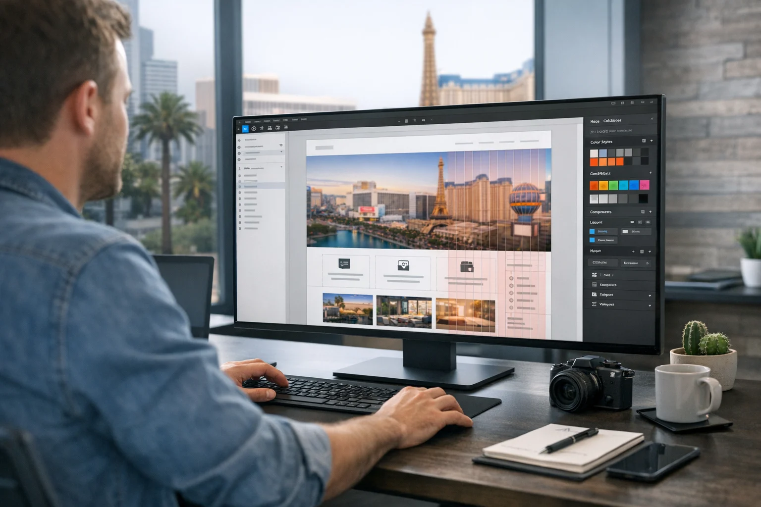
At SiteLiftMedia, we work with businesses across the country, with a strong concentration of clients looking for web design Las Vegas support, local SEO Las Vegas strategy, and technical fixes that help their sites load faster and convert better. One pattern shows up again and again: a site starts with a page builder because it feels fast, then it gets patched, layered, and overbuilt until simple changes become expensive and performance starts slipping.
Cleaner layouts do not require a giant framework or a visual builder packed with controls. They require smart structure, a few reusable CSS rules, and a clear idea of what each section needs to do. That means less visual noise, more consistency, and a site that is easier to maintain as your business grows.
If you want a practical way to think about CSS without turning this into a developer textbook, start here.
Why cleaner layouts matter more than most teams realize
When people talk about layout, they often mean aesthetics. That is only part of the picture. A clean layout affects how quickly a visitor understands your offer, how easily they move through the page, and how much unnecessary code the browser has to process.
That matters for:
- SEO performance because lighter, better structured pages tend to perform better in search and support stronger technical SEO.
- User experience because spacing, alignment, and visual hierarchy reduce friction.
- Conversion rates because a clean layout keeps attention on the offer instead of competing design elements.
- Maintenance because a site built with sensible CSS is easier to update than one held together by builder settings and overrides.
- Security and stability because fewer add-ons and unnecessary dependencies usually mean fewer things to patch, monitor, and troubleshoot.
For businesses competing in crowded service markets, especially in Las Vegas where local competition is intense, the difference between a clean site and a bloated one often shows up in rankings, lead quality, and ad efficiency. If you're investing in Las Vegas SEO, PPC, social media marketing, or backlink building services, sending traffic to a messy page layout weakens every other marketing channel.
If you want the deeper SEO and speed case against drag and drop tools, SiteLiftMedia already covered why bloated page builders hurt SEO, speed, and sales.
Start with structure, not decoration
The biggest layout mistake most people make is starting with visuals instead of structure. In a page builder, it is common to drag in a section, then a row, then another row, then columns inside columns, then padding controls on every block until the page looks right. It may work visually for a moment, but the logic behind the page is weak.
CSS works better when your HTML structure is simple and intentional. Before thinking about colors, shadows, or animation, define the actual layout roles on the page.
For most business websites, your structure usually comes down to a few dependable layers:
- A page container that controls the content width.
- Sections that create vertical rhythm and separate topics.
- Content wrappers for text blocks, forms, media, or cards.
- Layout systems such as Flexbox or Grid for alignment.
- Reusable components like buttons, testimonials, service cards, pricing blocks, and FAQs.
That approach is what makes custom web design feel polished. It also keeps the site adaptable. If your sales team asks for a new section, or your marketing team wants to launch a summer campaign quickly, a structured CSS system lets you add and revise without breaking half the page.
Use a container to control width and readability
One of the easiest ways to clean up a layout is to stop content from stretching edge to edge. Wide text blocks look messy, especially on large desktop monitors. A simple container with a max width instantly improves readability and gives the design a more intentional shape.
A clean layout usually includes:
- A max width for the main content area.
- Automatic horizontal centering.
- Consistent left and right padding so content does not crash into screen edges on smaller devices.
This single decision solves a surprising number of layout issues. Headlines feel more controlled. Paragraphs become easier to scan. Forms and service lists look less chaotic. It also creates a visual system that can carry across your homepage, service pages, blog content, and landing pages.
For teams that get stuck on centering and alignment, this quick guide from SiteLiftMedia on how to center elements with CSS is worth bookmarking.
Use spacing as a system, not a one off fix
When a page looks cluttered, people usually assume the problem is color or typography. More often, the real issue is inconsistent spacing. Page builders encourage random spacing because every section has its own sliders and overrides. One block gets 37 pixels of padding, another gets 62, and nobody remembers why.
Cleaner layouts come from a spacing system.
That means choosing a limited set of spacing values and repeating them throughout the site. For example, you might use a small spacing value for tightly related items, a medium value for component padding, and a larger value for section separation. Once that rhythm is established, the site starts feeling professional without extra visual tricks.
Spacing should support hierarchy:
- Small spacing between label and input, icon and text, or heading and short description.
- Medium spacing inside cards, feature blocks, and callout areas.
- Large spacing between major sections so the page breathes.
This is where hands on CSS work beats page builders. Instead of fighting one section at a time, you define patterns once and apply them across the whole site.
Choose the right layout tool: Flexbox or Grid
A lot of layout problems come from using the wrong CSS method. Flexbox and Grid are both excellent, but they solve different problems.
When Flexbox is the better choice
Flexbox is ideal when you are arranging items in one direction, either in a row or a column. Think navigation bars, button groups, icon and text rows, simple two column content blocks, or aligning items inside a card.
Flexbox works well when you need:
- Horizontal or vertical alignment
- Equal distribution of space
- Items to wrap naturally on smaller screens
- Simple row based layouts
For many service pages, Flexbox is enough. A hero section with text on one side and an image on the other, a set of trust badges, or a contact bar can all be handled cleanly with Flexbox.
When Grid makes more sense
CSS Grid is better for full section layouts and multi column arrangements. If you have pricing tables, portfolio blocks, feature cards, service category groupings, or testimonial layouts, Grid gives you more control with less code.
Grid is useful when you need:
- Multiple columns and rows
- Consistent alignment between cards
- Predictable gaps between elements
- Responsive layouts that collapse cleanly
Businesses investing in custom web design often discover that Grid replaces a lot of what page builders were doing badly. Instead of stacking rows inside rows, you can define a section once and let the browser handle the layout properly.
Build cleaner sections with fewer wrappers
One of the hidden problems with page builders is wrapper inflation. A simple call to action might end up buried inside section wrappers, row wrappers, column wrappers, inner wrappers, and widget wrappers. That adds bloat and makes small changes annoying.
Cleaner CSS layouts usually come from reducing unnecessary nesting. Each section should have a clear purpose and only the containers it actually needs.
A typical clean section might include:
- A section element for vertical spacing and background color
- A single centered container for width control
- A heading group
- A Grid or Flex layout for the actual content
That is usually enough.
Less nesting helps with maintainability, but it also supports performance. When you're trying to improve page speed for SEO company Las Vegas searches or conversion focused landing pages, reducing DOM complexity is not a minor detail. It affects rendering, debugging, and editing speed too.
Use typography to create hierarchy before adding design effects
If a page looks busy, resist the urge to fix it with borders, shadows, gradients, or animation. Start with typography. Strong layout depends on clear visual hierarchy, and typography does most of that work.
Cleaner page layouts usually have:
- One obvious headline size for the main message
- A limited set of heading sizes for section structure
- Body text with comfortable line height
- Reasonable line length so paragraphs stay readable
- Consistent font weight rules instead of random bolding
Business sites often overcomplicate this. Every section gets a different style, every sentence is emphasized, and the page ends up shouting at the visitor. Clean CSS helps you standardize heading styles, paragraph spacing, and text widths so each page feels connected to the rest of the site.
This also helps when your content team is publishing articles to support local SEO Las Vegas strategy, technical SEO campaigns, or lead generation pages. The content stays readable without requiring a designer to adjust every post manually.
Create reusable utility classes for common layout problems
You do not need a massive utility framework to benefit from utility thinking. A few simple CSS classes can eliminate a lot of repeated work.
Useful reusable classes often cover things like:
- Centered text
- Section padding
- Constrained content width
- Two column layouts
- Vertical stacks with consistent gaps
- Buttons with primary and secondary styles
- Hidden on mobile or adjusted for desktop
The point is not to turn every page into a class soup. It is to stop rewriting the same layout logic in different places. That is one reason custom sites built by experienced teams stay cleaner over time. They establish patterns early, then reuse them instead of improvising with each new page.
At SiteLiftMedia, that kind of system thinking is part of how we approach web design, website maintenance, and broader digital growth work. It also reduces the odds that marketing teams will need emergency fixes every time campaign demands change.
Design mobile first, then scale up
A lot of messy layouts happen because desktop design gets all the attention and mobile becomes an afterthought. Then someone starts hiding elements, forcing columns to stack awkwardly, and patching spacing with overrides.
Cleaner CSS comes from a mobile first mindset. Build the content flow for smaller screens first, then enhance the layout as the screen gets wider. That usually leads to simpler markup and fewer breakpoints.
For mobile friendly layout decisions, focus on:
- Single column readability first
- Buttons that are easy to tap
- Spacing that avoids crowding
- Images that scale without wrecking layout
- Navigation that remains usable under pressure
This matters a lot for local service businesses. Someone searching on their phone for a provider in Las Vegas is not grading your site on artistic ambition. They want to understand your services, trust your business, and contact you quickly. Clean responsive CSS supports that better than a builder page loaded with decorative clutter.
If mobile layout is one of your sticking points, read SiteLiftMedia's guide on improving mobile website layouts with responsive CSS.
Keep backgrounds, borders, and effects under control
There is a pattern I have seen on dozens of underperforming business sites: every section has a background color, every card has a shadow, every button has a gradient, and every heading sits on top of some decorative shape. It feels designed, but it is usually just visual noise.
Cleaner layouts rely on restraint.
A good rule is to let spacing and hierarchy do most of the work. Use background changes to signal major section shifts, not every block. Use borders to define important boundaries, not to outline every item. Use shadows sparingly, especially on mobile where too many layered effects make the page feel heavy.
This is one of the fastest ways to make a site look more premium without a full redesign. It also pairs well with fast hosting and performance optimization because a simpler visual system is often lighter on the browser.
Think beyond design: cleaner CSS also supports security and maintenance
Business owners often separate design decisions from technical operations, but they are connected. If your site depends on a chain of page builder add-ons, animation plugins, widget packs, and theme overrides, your maintenance load increases. That can affect performance, update risk, and security exposure.
A simpler CSS driven layout reduces dependency on third party builder layers. That makes it easier to manage:
- Website maintenance across updates
- System administration decisions tied to hosting and deployment
- Server hardening and performance tuning
- Business website security by shrinking the surface area created by unnecessary plugins
- Cybersecurity services like audits and monitoring because the site architecture is easier to understand
For companies handling customer data, quote requests, appointment forms, or internal portal access, this matters. Clean front end architecture is not the same as penetration testing, but it absolutely contributes to a healthier web stack. Fewer moving parts usually mean fewer unpleasant surprises.
What this looks like in the real world for business websites
Say you run a law firm, contractor business, medical practice, home service brand, or B2B company targeting Nevada and beyond. Your homepage probably needs the same core layout pieces most lead generation sites need:
- A hero section with one clear message and one main call to action
- A service overview with scannable cards or columns
- A proof section with reviews, credentials, or results
- A process or benefits section
- A local trust section that supports Las Vegas SEO or broader regional relevance
- A contact section or quote form
None of that requires a page builder maze. With CSS, each of those sections can use the same container width, the same spacing rules, the same responsive breakpoints, and a small set of component styles. That is where consistency comes from.
It is also where better ranking support comes from. A cleaner page is easier to pair with strong metadata, solid internal linking, better Core Web Vitals, and content designed around real search intent. If your business is trying to compete in searches like SEO company Las Vegas, web design Las Vegas, or local SEO Las Vegas, that combination matters more than visual gimmicks.
Common layout mistakes teams make when moving away from builders
Switching from a page builder to CSS does not automatically create good design. There are still mistakes to avoid.
Trying to recreate the builder exactly
If you copy every decorative choice and every nested layout from the builder version, you keep the same problems. Use the move as a chance to simplify.
Creating too many one off classes
Some teams replace builder clutter with CSS clutter. If every section gets a unique class and custom exception, the system gets messy fast.
Ignoring content length
Clean layouts need to handle real content, not just placeholder text. Service descriptions, FAQs, and testimonials vary in length. Build for that reality.
Designing without marketing goals
A page can be clean and still ineffective. The layout should guide users toward inquiries, calls, purchases, or bookings. Design should support the business goal.
Forgetting local intent
If your market is competitive, layout should reinforce relevance. That might mean sections for service areas, local proof, reviews, or city specific landing pages that feel custom instead of duplicated.
When it makes sense to bring in an agency
Some businesses can clean up their site internally. Others are already too deep in a tangled theme and plugin setup to make easy progress. If your team keeps spending hours adjusting padding, fixing mobile breakpoints, or troubleshooting speed issues after every update, it is probably time to stop patching and rebuild the layout properly.
That is where agency support becomes practical.
SiteLiftMedia helps companies with custom web design, technical SEO, hosting and performance improvements, website maintenance, cybersecurity services, and digital growth strategy. For Las Vegas businesses especially, we see the competitive pressure up close. Whether you're trying to improve lead generation, prepare for stronger seasonal competition, support a new social media marketing push, or tighten your site before a larger SEO campaign, cleaner CSS architecture gives you a better foundation.
If your current site feels heavy, hard to update, or too dependent on page builder workarounds, start with a layout audit. Identify the sections that can be rebuilt with lean CSS, fix the structure before you spend more on traffic, and if you want help with the design, SEO, hosting, security, and long term maintenance side, contact SiteLiftMedia.
Photo Gallery