Responsive web design used to be treated like a box to check. Make the site fit mobile screens, make sure nothing breaks, and move on. That approach no longer works. Today, responsive design has a direct effect on how your site ranks, how long people stay, and whether visitors turn into leads or sales.
For business owners and marketing teams, that matters because traffic alone is not the goal. Qualified traffic that converts is. If your website looks polished on desktop but becomes cluttered, slow, or frustrating on a phone, your SEO and conversion rate both suffer. Google sees the weak user experience. Your prospects feel it right away.
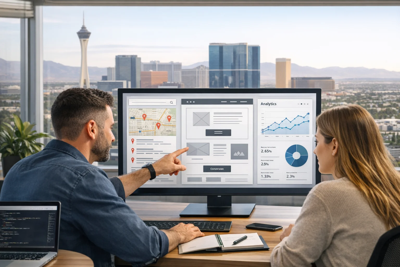
At SiteLiftMedia, we see this all the time with businesses in Nevada and across the country. A company invests in content, PPC, social media marketing, or Las Vegas SEO, but the website underneath it is still working against them. The layout shifts, the menu gets confusing, the forms are hard to use, and key calls to action disappear below the fold on smaller screens. That is not just a design issue. It is a growth issue.
If you are targeting competitive search intent like web design Las Vegas, SEO company Las Vegas, or local SEO Las Vegas, your site cannot afford to be average on mobile. The businesses that win more organic visibility and more leads are usually the ones that treat responsive design as part of their SEO and conversion strategy from the start.
Why responsive design affects rankings and revenue
Google evaluates sites through a mobile-first lens. That means the mobile version of your pages carries real weight when search engines crawl, index, and rank your content. If the mobile experience strips out content, hides internal links, slows down load times, or creates usability issues, your visibility can suffer.
There is also the human side of the equation. Buyers compare options quickly, especially in local service markets. Someone looking for a Las Vegas contractor, law firm, med spa, restaurant group, or B2B service provider is often searching on a phone between meetings, while traveling, or during a busy workday. They want clear information fast. If they have to pinch, zoom, hunt for contact details, or wait for oversized assets to load, they leave.
Responsive design has to do more than resize columns. It has to protect the buying journey on every screen size. Good responsive execution supports technical SEO, cleaner engagement signals, stronger lead flow, and less friction from first click to contact.
Start with content hierarchy, not screen size
One of the most effective responsive web design tactics is also one of the most overlooked. Plan your content hierarchy before you worry about visual decoration. On small screens, weak prioritization becomes obvious fast. If everything is competing for attention, users stop caring.
A strong responsive page answers a few questions in the right order:
- What does this business do?
- Who is it for?
- Why should I trust it?
- What should I do next?
That sounds simple, but many websites miss it. They open with oversized banners, generic headlines, sliders, and stock imagery while the actual selling points are buried lower on the page. On mobile, that becomes even more damaging because every extra swipe creates more drop-off.
When SiteLiftMedia works on custom web design projects, we usually start by reducing the number of competing messages on important pages. Headlines become more specific. Supporting copy gets tighter. Trust signals move closer to calls to action. Service pages are structured so users can scan them quickly without losing context. That makes the design stronger and also helps search engines understand page intent.
If your current site feels visually busy, that is often a sign the page structure needs work before the styling does. Site architecture, heading order, and content flow matter just as much as the interface. SiteLiftMedia has covered this in more detail in Why clean page structure matters as much as design.
Design mobile interactions for conversion, not just compliance
A lot of websites technically qualify as responsive, but they are not designed to convert on mobile. There is a difference.
A conversion-focused mobile layout removes hesitation. It makes it easy for someone to call, fill out a form, request a quote, schedule a consultation, or visit a location page. It also avoids common friction points like tiny tap targets, crowded navigation, floating elements that block content, and popups that cover the screen.
What works well on smaller screens
- Sticky call buttons for high-intent service pages
- Short forms with only the fields you actually need
- Clear service summaries near the top of the page
- Trust markers such as reviews, certifications, and years in business placed early
- Readable font sizes with enough spacing between sections
- Primary calls to action repeated naturally throughout the page
For local service businesses in Las Vegas, click-to-call behavior is especially important. Mobile users often want immediate contact. If your number is buried in the footer or hidden behind multiple taps, you are losing opportunities that were ready to convert. The same goes for map access, service area details, and business hours.
This is where web design and local SEO Las Vegas strategy overlap. A well-built responsive layout helps local visitors act quickly, and it helps Google connect your page content to real business intent.
Speed is a responsive design tactic, not a separate project
Website speed is often discussed like it belongs in a separate department from design. In reality, design choices drive a large share of performance problems. Heavy video backgrounds, oversized images, bloated page builders, excessive scripts, and animation overload can quietly hurt both SEO and conversion performance.
Fast mobile pages tend to keep users engaged longer. They also reduce bounce rates on high-value pages like service pages, landing pages, and location pages. In competitive markets, shaving seconds off load time can improve lead generation more than adding another paragraph of copy.
Some of the most reliable responsive speed improvements include:
- Using appropriately sized images for each viewport
- Serving modern image formats where supported
- Reducing third-party script load
- Limiting decorative effects that do not help conversions
- Building lean templates instead of relying on bloated builders
- Prioritizing above-the-fold content loading
For Las Vegas businesses, speed can matter even more because so much local discovery happens on mobile while people are on the move. If you want a deeper look at the local impact, see Why fast loading websites matter for Las Vegas businesses.
And if your current site relies on a bulky drag-and-drop system that makes every page heavy, you are not imagining it. SiteLiftMedia has also broken down why bloated page builders hurt SEO, speed, and sales.
Keep the same SEO value across desktop and mobile
One common mistake in responsive builds is hiding too much content or functionality on mobile. Businesses sometimes think they are simplifying the experience, but they end up weakening the page. Important internal links disappear. FAQs get removed. Service details become collapsed to the point where users never see them. That hurts usability and can reduce SEO value.
Responsive design should reorganize content, not erase it. The desktop and mobile versions should support the same search intent, the same core messaging, and the same conversion path.
That is especially important for businesses investing in technical SEO, backlink building services, and content expansion. If you are putting time and money into getting stronger visibility, your responsive layout needs to preserve the value of that work. Google still needs to crawl meaningful text, understand topical relevance, and follow internal links across service clusters and location pages.
For example, a company targeting searches around SEO company Las Vegas may have separate pages for local SEO, technical SEO, web design, PPC, and website maintenance. On desktop, those pages may be easy to discover through visible navigation and content blocks. On mobile, if those links are hidden too deeply or removed from the template, the crawl path and user journey both get weaker.
Strong responsive design supports discoverability. It should help users find the next relevant page with minimal friction.
Build local signals into responsive layouts
If your business depends on local visibility, your responsive design should reinforce location relevance naturally. This is not about stuffing city names everywhere. It is about presenting local trust and service area information in a way that works cleanly on every device.
Useful local elements include:
- Visible NAP details where appropriate
- Location pages with clear service coverage
- Embedded maps used thoughtfully, not in a way that slows the page
- Locally relevant testimonials and case examples
- Fast access to hours, directions, and contact options
- Schema implementation that supports business and location data
For a brand serving nationwide clients while emphasizing Nevada, this becomes a balancing act. You want to show broad capability without losing local trust. SiteLiftMedia often helps companies do this by giving Las Vegas pages and Nevada service content their own strategic place in the site structure, while still presenting the business as a scalable national partner.
That matters for terms like web design Las Vegas or Las Vegas SEO because local intent is often tied to confidence. Searchers want proof that you understand the market, the competition, and the real buying behavior of the region, not just generic agency language.
Use navigation that stays simple under pressure
Navigation often looks fine during the design review and then breaks down in real use. Menus become overloaded. Dropdowns stack too deep. Labels are vague. Important pages are buried. On mobile, that confusion gets amplified.
Responsive navigation should be ruthlessly clear. A business website usually needs a short list of top priorities: services, industries, locations, about, resources, and contact. If everything is a top priority, nothing is.
For SEO, clear navigation also helps distribute authority through the site. It strengthens internal linking and makes service relationships easier to understand. For conversions, it reduces the time it takes a visitor to find what they need.
When planning a redesign, this is one of the first places worth auditing. If you are considering a larger rebuild, SiteLiftMedia has a useful guide on how to plan an SEO friendly website redesign for growth.
Make forms and lead capture responsive by intent
Most business websites lose conversions through forms, not because people are not interested, but because the form experience feels like work. Responsive design can fix a lot of that when it is tied to user intent.
A quote request form does not need the same structure as a newsletter signup. A service consultation form should not feel like an intake packet. Mobile users want progress with as little effort as possible.
Lead form improvements that usually pay off
- Use the right input type for phone numbers and emails
- Break long forms into logical steps when needed
- Keep labels visible instead of relying only on placeholders
- Show reassurance near the submit button, such as response time or privacy notes
- Make buttons large enough to tap comfortably
- Test forms on real devices, not just browser resizing tools
For local lead generation, consider the context of the search. Someone looking for cybersecurity services, penetration testing, server hardening, or business website security may need reassurance before they submit. That means your responsive page should place credibility signals near the form, especially on mobile where users do not always scroll back up to review your qualifications.
The same principle applies to service pages for website maintenance, system administration, or custom web design. If the lead form appears too early, before value and trust have been established, conversion rates suffer. If it appears too late, users may never reach it. Responsive design helps you control that timing.
Accessibility improvements help both usability and SEO
Accessible design is not a side issue. It improves readability, interaction quality, and in many cases search performance because accessible sites tend to have cleaner structure and clearer content patterns.
Responsive accessibility work includes:
- Strong color contrast on buttons and text
- Logical heading hierarchy
- Keyboard-friendly navigation elements
- Forms with clear labels and error states
- Buttons and links that are easy to tap
- Media and motion choices that do not create barriers
These changes make a site easier to use for everyone, not just users with specific accessibility needs. They also make the page feel more professional, which supports trust and conversion. If you want a practical checklist, take a look at accessibility fixes modern business websites should make.
Responsive trust signals are critical for service businesses
Trust is fragile on mobile. Smaller screens leave less room for context, so the wrong layout can make even a legitimate business feel thin or unproven. That is why your responsive design should intentionally surface proof points early and often.
Strong trust elements include client logos, review snippets, certifications, team photos, project results, industry associations, and clear service process explanations. The key is how they are arranged. On mobile, trust signals need to appear close to the claims they support.
If your page says you deliver measurable growth, show a case result nearby. If you say your agency handles business website security, show your expertise in cybersecurity services, penetration testing, or server hardening in the same section or shortly after. If you offer website maintenance and system administration, explain what is proactive, what is monitored, and what the client gets day to day.
That kind of responsive credibility is especially valuable during spring marketing pushes or redesign planning cycles, when businesses are reevaluating vendors and trying to clean up weak infrastructure before scaling traffic.
Security and performance are part of the user experience
Decision-makers are paying more attention to what sits behind the design. A site that looks modern but has broken forms, outdated plugins, mixed content warnings, or a weak hosting setup can still lose business. Responsive design works best when it is paired with stable infrastructure.
This is where agency support becomes more valuable than a design-only approach. At SiteLiftMedia, responsive website improvements are often connected to broader cleanup work such as website maintenance, plugin reduction, technical SEO fixes, image optimization, caching, form testing, and infrastructure reviews. For some clients, that extends into cybersecurity services, system administration, or server hardening when the environment itself is part of the problem.
That kind of support matters because conversions are not won through visual polish alone. They are won through reliability. If visitors cannot trust the experience, they hesitate. If search engines hit technical problems, rankings get harder to grow.
When a responsive redesign makes more sense than patching
Not every underperforming site needs a full rebuild, but many do. If your current site is difficult to update, inconsistent across devices, packed with workarounds, and slow despite repeated patching, redesigning around modern responsive standards is usually the smarter long-term investment.
Some warning signs include:
- Mobile traffic is high but lead volume is low
- Important pages have poor engagement metrics on phones
- The site uses outdated templates or fragile plugins
- Core Web Vitals remain weak after small fixes
- Service pages do not rank despite ongoing SEO work
- Your team avoids updating the site because it is too cumbersome
Businesses often reach this point after layering too many disconnected marketing tactics on top of an old website. They may be running PPC, investing in backlink building services, posting on social media marketing channels, and publishing blog content, but the site itself is still slowing everything down.
That is usually the point where it makes more sense to stop patching around structural problems and rebuild with clear goals for SEO, speed, security, and conversion performance.
If your website is bringing in traffic but not enough qualified leads, or if your mobile experience feels like a compromise instead of an advantage, SiteLiftMedia can help you fix the real bottlenecks. We build responsive websites designed to rank, built to convert, and strong enough to support everything from Las Vegas SEO campaigns to national growth efforts. If you want a serious review of your current site, reach out to SiteLiftMedia and see where responsive design can start paying for itself.
Photo Gallery