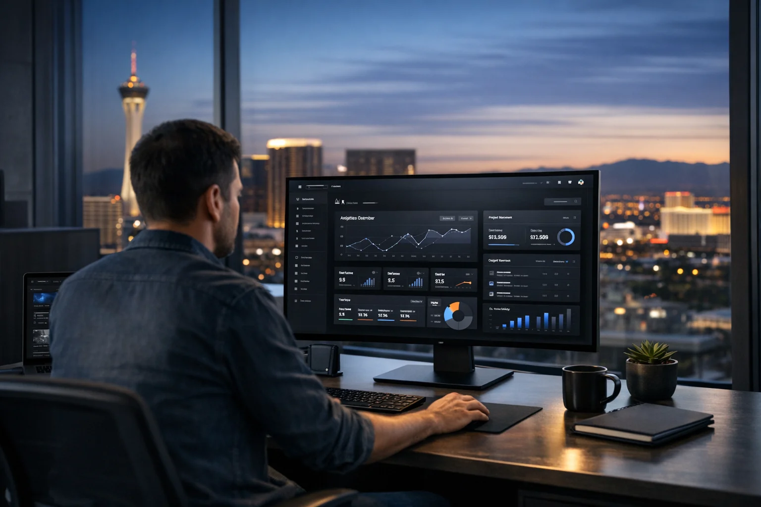
Dark mode isn’t just a design trend people switch on at night. It has become part of how modern brands communicate quality, clarity, and confidence online. When it’s done well, a dark interface can make a business website feel premium, current, and easier to use on mobile. When it’s done poorly, it can bury calls to action, hurt readability, and quietly drag down conversions.
That’s the part many businesses miss. A modern website shouldn’t just look impressive in a pitch meeting. It needs to support search visibility, paid traffic, lead generation, accessibility, and trust. For companies competing in Las Vegas, where attention is expensive and first impressions happen fast, design choices carry real business weight. The same is true for brands nationwide, but the Las Vegas market adds pressure because users are comparing you against polished hospitality brands, entertainment experiences, and aggressive local competitors.
At SiteLiftMedia, we look at dark mode and current web design trends through a practical lens. We’re not chasing design fads for the sake of it. We build websites that help business owners, marketing managers, and decision makers get more value from every visit. That means balancing custom web design with technical SEO, speed, content structure, accessibility, and conversion strategy.
Why dark mode became a serious design choice
There was a time when dark websites felt niche or experimental. That has changed. Users are now comfortable with dark interfaces in mobile operating systems, SaaS platforms, dashboards, streaming apps, and premium consumer brands. A dark UI can feel calmer, more focused, and more sophisticated than a bright interface filled with white space and harsh contrast.
There are a few reasons it works so well today:
- Mobile behavior changed. People browse in low light, from their phones, and between tasks. Dark interfaces often feel more comfortable in those moments.
- Modern brands want visual depth. Dark backgrounds can make photography, product imagery, and accent colors stand out in a stronger way.
- Users associate dark mode with premium digital products. That perception can help service businesses, ecommerce brands, and high-end local companies look more current.
- Design systems are more mature. Teams now have a better understanding of how to build dark and light experiences more consistently.
Still, dark mode is not automatically right for every website. A law firm with an older audience may need a lighter presentation. A medical provider may want a cleaner, brighter look that feels more clinical and reassuring. A luxury contractor, modern restaurant group, SaaS company, or entertainment brand may benefit more from a darker visual direction. The right answer depends on brand position, audience behavior, and conversion goals.
What makes dark mode actually work on a business website
A lot of dark websites fail because they stop at appearance. The background turns charcoal, the text becomes gray, and the team assumes the site feels modern. That is not a strategy. A good dark interface needs structure.
Readable contrast comes first
Poor contrast is one of the fastest ways to make a website harder to use. Thin light gray text on a dark gray background may look sleek in a mockup, but it usually performs badly in the real world. Users skim. They do not study your page like a poster.
The strongest dark interfaces use contrast intentionally. Headings should feel crisp. Body copy should be easy to scan. Links, buttons, and form labels need to stand out right away. If users have to hunt for the next step, the design is working against the business.
Accent colors need discipline
Dark backgrounds make color more dramatic. That is useful, but it can also get messy fast. Neon overload is one of the most common mistakes in dark mode design. One or two strong accent colors are usually enough. They should support hierarchy, not fight for attention.
We often recommend choosing a single primary action color and one secondary support color. That keeps calls to action consistent across service pages, landing pages, and mobile layouts.
Depth should guide attention
Shadows, borders, subtle gradients, and layered containers matter more in dark interfaces because you are working with less obvious separation. Without those cues, sections blend together. Users lose their place, especially on longer pages.
Modern dark design works best when each content block has a clear reason to exist. This is where strategy beats decoration. If a section explains a service, proves credibility, or drives contact intent, it deserves visual separation. If it does not, it probably should not be there.
- Use dark tones with enough variation to separate sections.
- Keep buttons bright and unmistakable.
- Make forms easy to spot and complete.
- Test text and icons on actual mobile screens, not just desktop previews.
Current web design trends that pair well with dark interfaces
Dark mode is only one piece of the bigger design picture. The strongest websites combine it with broader UI and UX trends that improve usability and lead quality. If you want to see how this is evolving locally, this look at web design trends Las Vegas businesses should watch gives a helpful market-level view.
Large typography with tighter messaging
Big headlines are still a major trend, and for good reason. They help users understand what you do quickly. On a dark background, large type can feel especially confident and clean. The key is brevity. If your hero headline needs three lines to explain your offer, it is not doing enough work.
Clear messaging matters for service businesses in competitive markets. If someone lands on your page after searching web design Las Vegas or SEO company Las Vegas, they should know within seconds what you offer, who you help, and why they should keep scrolling.
Modular layouts that break up long pages
Long scrolling pages are still common, but the best ones do not feel long. They move in distinct blocks with clear transitions: offer, proof, process, industries, FAQs, contact. Dark mode supports this well when each module has intentional spacing and contrast.
Subtle motion, not motion for its own sake
Microinteractions, hover states, and restrained scroll animation can make a dark interface feel polished. What does not work is heavy animation that delays content, hurts mobile performance, or distracts from the call to action. If the motion does not support orientation or feedback, it is usually just noise.
Immersive imagery and video with performance control
Dark interfaces are often paired with rich visuals, especially for hospitality, luxury services, events, architecture, and high-end product brands. That can be effective in Las Vegas, where customers expect a certain level of visual energy. But performance still matters. A slow homepage can erase the benefit of a great visual direction. We’ve covered that balance here: make your Las Vegas website modern without slowing it down.
The practical rule is simple: use fewer assets, choose them carefully, and compress them properly. That keeps the modern feel without punishing users on slower mobile connections.
Where dark mode hurts conversions when teams get too stylistic
Design can absolutely improve conversion rates, but dark mode comes with a few common traps. We see these often during redesign audits.
Calls to action disappear into the palette
Buttons are supposed to stand out. On too many dark sites, they blend into the background or rely on low-contrast outlines that do not feel clickable. If your button style looks elegant but underperforms, elegance is not helping.
Forms become harder to complete
Forms already ask for effort. Dark styling can make them worse if field borders are faint, placeholders are doing too much work, or validation states are unclear. Contact forms, quote requests, consultations, and demo forms need to feel easy.
Visual hierarchy breaks down
When everything is dark and everything glows, nothing stands out. Users need a clear scan path. Headline, support copy, proof point, button. That path should be obvious on desktop and mobile.
Teams mistake premium for complicated
A modern design should reduce friction, not add mystery. If users cannot tell what the company does, where to click, or why they should trust the business, the site is underperforming no matter how polished it looks.
This matters even more for landing pages tied to PPC, social media marketing, or local lead generation campaigns. Every visual decision affects conversion efficiency. If you have traffic but weak lead volume, there is a good chance design clarity is part of the problem. SiteLiftMedia often addresses this in redesigns after businesses run into the same issues highlighted in website design mistakes hurting Las Vegas conversions.
Modern design still lives or dies on SEO fundamentals
Dark mode will not help rankings by itself. Search engines do not reward a site because it looks current. They reward websites that are useful, crawlable, fast, well structured, and aligned with search intent.
That is why good web design and SEO should never be treated as separate efforts. A site can look incredible and still struggle because the technical SEO foundation is weak. We see this often with businesses that invest heavily in design but skip performance tuning, page structure, indexation checks, or local search alignment.
For companies targeting Las Vegas SEO, local SEO Las Vegas campaigns, or broader regional terms, design needs to support the following:
- Fast load times. Heavy background video, oversized images, and bloated scripts can hurt Core Web Vitals.
- Clean page structure. Service pages should be easy for users and search engines to understand.
- Intent matching. A homepage should not try to rank for every service and every city at once.
- Internal navigation clarity. Users need direct paths to SEO, PPC, web design, app development, and support services.
- Local signals. If you want visibility for web design Las Vegas or SEO company Las Vegas, local relevance needs to be built into content and page targeting naturally.
Dark mode adds one more technical consideration: asset management. Designers often layer gradients, videos, transparent effects, and large image files to create depth. If those assets are not optimized, the site pays for it in speed. That can weaken organic performance and ad efficiency at the same time.
Rankings also do not come from design alone. They come from a mix of technical SEO, content quality, backlink building services, on-page optimization, and strong engagement signals. A modern interface should help users stay on the site and take action, but it still needs real search strategy behind it.
Accessibility is not optional in dark interfaces
Accessibility issues are often easier to spot in dark designs because contrast errors show up quickly. The fix is not to avoid dark mode. The fix is to build it correctly.
Some of the biggest accessibility points include:
- Text contrast that supports comfortable reading
- Visible focus states for keyboard navigation
- Clear button and link styling
- Form labels that remain readable at all times
- Motion settings that do not overwhelm sensitive users
- Good distinction between disabled, hover, active, and error states
Businesses sometimes treat accessibility like a compliance checkbox. In reality, it is a usability advantage. Accessible websites are easier for everyone to use. They reduce abandonment, improve trust, and often support stronger engagement metrics. If your current site needs work here, these accessibility fixes modern business websites should make are a smart place to start.
What works well for Las Vegas businesses right now
Las Vegas is a unique design environment. Businesses here compete in a market shaped by tourism, nightlife, hospitality, luxury branding, high mobile usage, and fast comparison behavior. Even B2B companies feel that influence because prospects are exposed to polished digital experiences all day.
That does not mean every Las Vegas business needs a dramatic dark homepage. It means your website should feel current enough to match user expectations without sacrificing clarity.
Hospitality, entertainment, and lifestyle brands
Dark mode often works especially well here. Rich photography, moody palettes, and immersive landing sections can create a strong emotional response. The design still needs fast paths to booking, inquiry, reservations, or event actions.
Professional services
For law firms, consultants, real estate groups, and financial services, a dark interface can work if it is restrained. Use it to create polish, not drama. Clean typography, strong trust signals, and highly visible forms matter more than visual effects.
Home services and local lead generation
These businesses often perform best with a hybrid approach. A darker brand palette can look modern, but the site still needs highly legible service blocks, local proof, review content, and prominent calls to action. Users searching in a hurry do not want to decode your design.
Healthcare and wellness
Dark mode can be elegant for select brands, especially premium wellness concepts, but bright and calm interfaces still outperform in many clinical settings. Trust and ease usually matter more than visual trendiness.
For Las Vegas businesses preparing for Q4, holiday traffic planning also changes the conversation. Seasonal campaigns, promotions, and landing pages often bring in colder traffic from paid ads and mobile searches. That is when clarity matters most. If the site is visually interesting but hard to use, your ad spend does the work and the website wastes it.
Security and maintenance still shape user trust
Modern design gets attention, but trust is built underneath the surface. A polished dark site that loads slowly, breaks under traffic, or gets compromised sends the wrong signal fast. For businesses investing in premium design, the technical side has to match.
This is where many agencies stop too early. They launch the redesign and move on. SiteLiftMedia works more broadly because a website is part of a larger digital system. That includes website maintenance, hosting stability, technical SEO upkeep, and real business website security practices.
If you are planning a redesign or moving to a more modern interface, it is smart to review:
- Website maintenance plans for updates, plugin oversight, backups, and uptime monitoring
- Cybersecurity services that reduce the risk of downtime, injection attacks, and credential abuse
- Penetration testing for sites or apps handling sensitive transactions or customer data
- Server hardening to reduce exposure on hosting environments and business infrastructure
- System administration support when traffic spikes, deployments, or integrations need experienced oversight
That matters even more for businesses running paid media, ecommerce, bookings, or lead campaigns during peak periods. A beautiful website that stalls during a product push or seasonal rush is more than frustrating. It is expensive.
How SiteLiftMedia approaches dark mode and modern web design
We do not start with a template and force every client into the same visual direction. We start by looking at brand position, customer behavior, revenue goals, and search opportunities. Sometimes dark mode is the right move. Sometimes a lighter, cleaner interface will produce better results. Sometimes the answer is a balanced system that uses darker sections selectively for emphasis.
Our process usually comes back to a few practical questions:
- What does the user need to understand in the first 10 seconds?
- Which service or offer drives the highest business value?
- What happens when this design meets SEO, PPC, and social traffic?
- Will this still feel usable on mobile after a long scroll?
- Can the team maintain and scale it without hurting performance?
That is why our web design work connects naturally with Las Vegas SEO strategy, local landing page planning, content structure, performance tuning, and lead generation systems. If a business also needs app development, cybersecurity services, social media marketing support, or a more reliable maintenance setup, we build with those realities in mind from the start.
A lot of redesigns fail because they treat the website like a static brochure. Modern business websites are not static. They are active sales tools. They need to support search intent, campaign traffic, brand credibility, and operational stability at the same time.
If your current site looks dated, loads too slowly, or feels visually disconnected from where your brand is headed, now is the time to fix it before your next growth push. Dark mode can be a smart part of that strategy when it is used for the right reasons. If you want a website that feels modern and performs like it should, contact SiteLiftMedia and we’ll map out the right direction for your brand, your market, and your growth goals.
Photo Gallery