Designing a homepage in Figma sounds straightforward until you realize how much that one page has to accomplish. It needs to make a strong first impression, explain what the business offers, guide people toward action, support SEO, and set the visual system for the rest of the site. If any one of those pieces is off, the homepage may still look polished, but it will not perform.
At SiteLiftMedia, we’ve seen this with startups, established service businesses, ecommerce brands, and companies in competitive local markets like Las Vegas, Nevada. A homepage for a company targeting searches like Las Vegas SEO, SEO company Las Vegas, web design Las Vegas, or local SEO Las Vegas cannot just look good. It needs to be strategic. The design in Figma should make development easier, content clearer, and lead generation more predictable.
If you’re a business owner, marketing manager, or decision maker reviewing homepage concepts, this guide will show you what a strong Figma homepage process looks like from the agency side. If you’re building internally, it will also help you avoid the expensive mistake of approving a design that looks great in a presentation but falls apart once it goes live.
Start with the job of the homepage, not the layout
Before you place a single headline or image block in Figma, get clear on what the homepage needs to do. This is where a lot of teams go wrong. They open a blank frame and start arranging sections before defining the page’s actual purpose.
Ask a few basic questions first:
- Who is the homepage speaking to? New visitors, returning visitors, local prospects, national buyers, investors, or hiring candidates?
- What action matters most? Calls, form fills, booked consultations, purchases, demo requests, or store visits?
- What objections need to be handled early? Price, trust, experience, timeline, security, or proof of results?
- What services or offers deserve homepage visibility? Not every service belongs above the fold.
For example, if you run a digital agency in Nevada, your homepage may need to introduce your broader capabilities while still supporting high intent local searches. That could mean featuring custom web design, technical SEO, PPC, social media marketing, cybersecurity services, and website maintenance, while also giving Las Vegas prospects confidence that you understand the local market.
A homepage with no clear priority usually turns into a crowded billboard. A homepage with a clear job feels focused from the first screen down.
Set up your Figma file so the design can scale
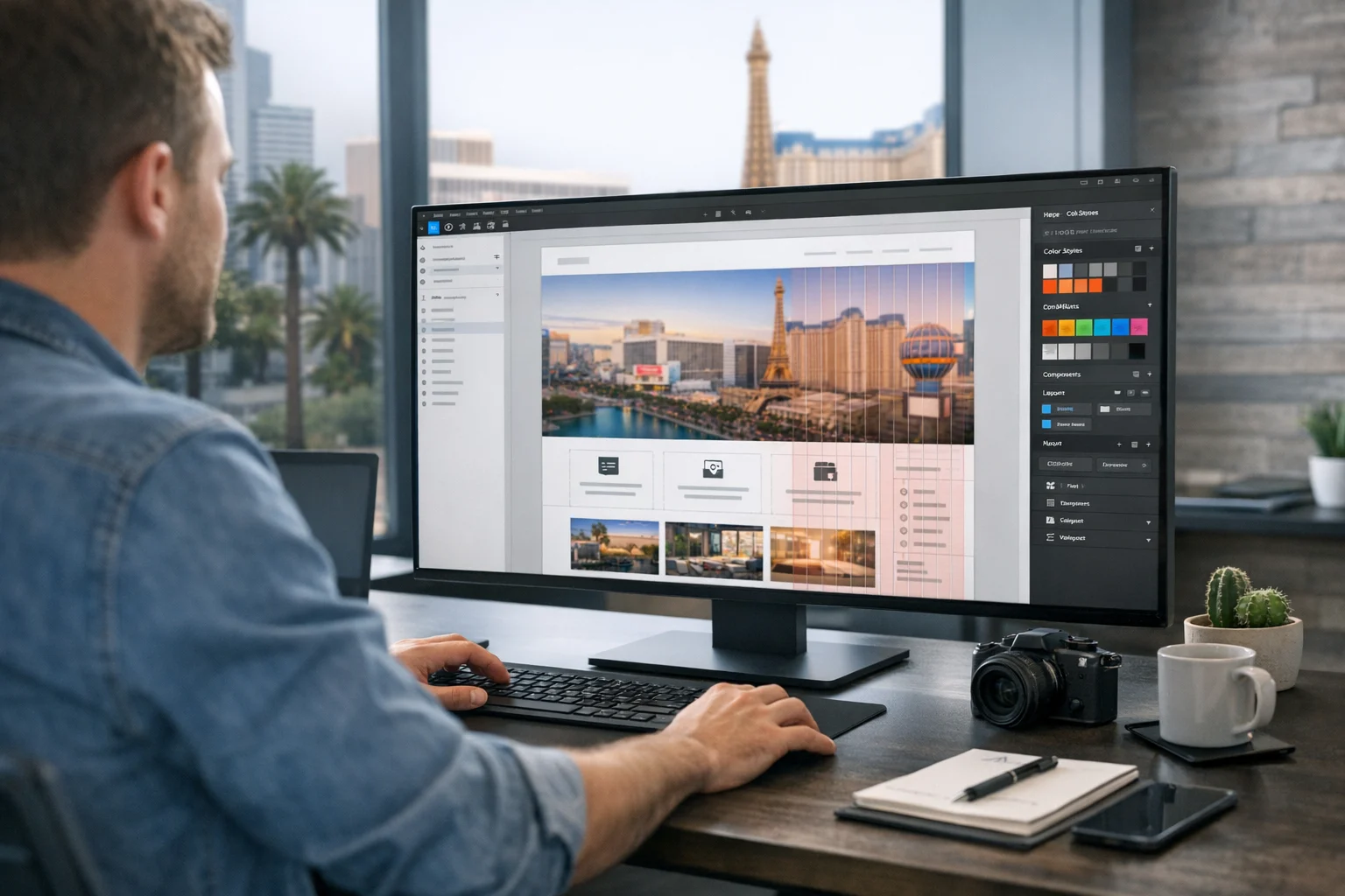
Good homepage design starts with a clean Figma setup. You do not need an elaborate system on day one, but you do need enough structure to keep the file from becoming a mess two revisions later.
Start with the basics:
- Create desktop and mobile frames from the beginning
- Set a clear grid for desktop spacing and content width
- Define text styles for headings, body copy, labels, and buttons
- Create color styles for primary, secondary, neutral, accent, and status colors
- Use components for buttons, cards, navigation, testimonials, and form fields
- Name layers and frames clearly so others can follow the work
This matters more than people think. When a marketing team, designer, developer, and stakeholder all touch the project, sloppy files slow everything down. If you need a deeper planning framework before design starts, SiteLiftMedia has also covered how to use Figma to plan a website before development, which is worth reviewing on bigger builds.
One practical tip from agency work, build with Auto Layout early. If your hero, service cards, testimonial rows, and CTA sections resize cleanly, you will save hours during revision rounds. Static boxes may look fine in a review call, but they become a headache as soon as copy changes.
Map the homepage sections before you style anything
Once the file is set up, create a rough wireframe before you start pushing visuals. Not a loose sketch in a notebook. A real homepage structure in Figma with simple blocks and content labels.
Most effective homepages follow a sequence like this:
- Hero section with one primary message and CTA
- Trust indicators such as client logos, ratings, awards, or metrics
- Primary services or solutions
- Differentiators or process
- Proof, such as case studies or testimonials
- Supporting content, FAQs, or location relevance
- Strong closing CTA
The exact order can change, but the logic should stay intact. Visitors need clarity before detail. They need proof before commitment.
For a business trying to rank and convert in Las Vegas, this structure often benefits from some local reinforcement. That does not mean stuffing the page with city names. It means naturally signaling market relevance through proof points, service examples, team positioning, and a CTA that speaks to real buying intent. A homepage can have nationwide reach and still feel relevant to someone searching for web design Las Vegas or local SEO Las Vegas.
Wireframing first also helps prevent a common problem, trying to solve weak messaging with stronger visuals. If the homepage makes no sense in grayscale blocks, color and motion will not fix it.
Build a hero section that says something useful
The hero section carries a lot of weight. It should answer the visitor’s first question within seconds: “Am I in the right place?”
Your hero should include five things:
- A clear headline that explains the core offer
- A supporting line that adds detail or value
- A primary CTA tied to the conversion goal
- An optional secondary action such as view work or get pricing
- A visual element that supports the message instead of distracting from it
Strong homepage design work in Figma usually avoids vague headlines, generic stock imagery, three competing calls to action, and giant mockup graphics that push the real message out of view.
If you’re designing for an agency, compare these two directions:
- Weak: “Digital Solutions for Growing Brands”
- Better: “Custom web design, SEO, and growth campaigns built to bring in better leads”
For local intent, a subheadline can add helpful context without sounding forced. Something like this is often enough: “Helping businesses in Las Vegas and across the U.S. improve rankings, speed, security, and conversions.”
In Figma, keep the hero copy real. Do not rely on placeholder text and promise you will fix it later. Real copy changes layout decisions. It affects line length, spacing, button width, and the balance between text and imagery. The sooner you test realistic messaging, the better your homepage will hold up in production.
Design for scanning, not just aesthetics
Most homepage visitors will not read every word. They scan. They pause on headlines, icons, visuals, metrics, and calls to action. A good Figma homepage should reflect that behavior.
Focus on visual hierarchy:
- Use one dominant headline size for page level messaging
- Keep supporting headings consistent from section to section
- Limit font choices so the page feels cohesive
- Create enough white space so sections do not blur together
- Use contrast deliberately so actions stand out
- Make sure body copy is readable, not tiny and decorative
This is where experienced design teams separate themselves. Plenty of homepages look modern. Fewer guide the eye in the right order.
It also helps to think like both a user and a search engine. Search crawlers do not see your gradients the way people do. They respond to structure, clarity, and content organization. That is one reason clean page structure matters as much as design. A homepage in Figma should make room for meaningful content blocks, not squeeze everything into a visual concept that only works on Dribbble.
Create service sections that support SEO and sales
One of the best uses of a homepage is guiding people into the right part of the site. That means your service section should do more than list vague categories. It should help users self select quickly.
If you’re designing a homepage for an agency or service business, each service card or content block should answer three silent questions:
- What is this service?
- Who is it for?
- Why should I click?
At SiteLiftMedia, this often means positioning services in clear business language, then letting the service pages go deeper. A homepage might introduce:
- Custom web design for businesses that need stronger first impressions and better conversion paths
- Technical SEO for sites with indexing, speed, structure, or crawl issues
- Backlink building services to support authority growth in competitive markets
- Social media marketing for brand visibility and campaign support
- Website maintenance for uptime, updates, backups, and platform stability
- Cybersecurity services including penetration testing, server hardening, and business website security improvements
- System administration and infrastructure support for companies that need reliable hosting and operations
That mix does two things. It improves user understanding, and it helps search engines connect the homepage to relevant service themes without stuffing keywords into every sentence.
For Las Vegas intent, a short supporting section can reinforce geography in a natural way. Maybe it mentions local campaigns, tourism seasonality, summer campaigns, or businesses preparing for stronger competition in the area. That kind of detail feels real because it is real. Generic “we serve your city” language rarely lands the same way.
Use components so revisions do not wreck the file
Homepage design rarely ends with version one. Headlines get shortened. Offers change. Service order gets shuffled. A testimonial is swapped. A stakeholder decides the CTA should say “Book a Strategy Call” instead of “Get Started.”
If your Figma file is built from loose shapes and manually adjusted spacing, those changes can break half the page. Components help prevent that.
Create reusable pieces for:
- Buttons and button states
- Navigation items and dropdown indicators
- Service cards
- Stat blocks
- Testimonials
- FAQ rows
- Form fields
- Section headers
Combine that with Auto Layout and your homepage becomes much easier to maintain. This is especially important when the design needs to move into development cleanly. If your goal is a smoother handoff, it helps to review what makes a website mockup developers can use instead of a pretty file that still needs to be rebuilt from scratch.
A practical agency rule here, if a section appears more than once, componentize it. Future you will be glad you did.
Design the mobile homepage earlier than you think
Many teams still design desktop first, get signoff, and then “make it responsive” later. That approach creates avoidable problems. The homepage may look strong at 1440 pixels and become cluttered, oversized, or awkward on phones, where a large share of traffic actually arrives.
As soon as the desktop direction is stable, build the mobile frame. In some cases, especially for local service businesses, we will test mobile structure even earlier because call driven traffic often skews heavily toward phones.
While designing mobile in Figma, watch for these issues:
- Hero sections that become too tall before users reach the CTA
- Text lines that break awkwardly and weaken the message
- Cards that stack endlessly without visual pacing
- Tiny tap targets in nav, forms, or button groups
- Testimonials or logo strips that become unreadable
- Animations or visuals that may feel heavy on slower connections
Mobile design also has a performance angle. If the homepage concept depends on huge background video, oversized imagery, and decorative scripts, the live site may pay for it later with weaker speed scores and worse engagement. Businesses investing in fast hosting, technical SEO, and lead generation do not want a homepage concept that fights the build from the start.
Make the Figma file easy for developers and marketers to use
A polished homepage comp is not the finish line. The real test is whether the design can be built accurately and updated without pain. This is where agency experience shows.
Inside Figma, prepare for handoff by being specific:
- Show spacing clearly and consistently
- Define hover and active states for buttons and links
- Include mobile and desktop behaviors for major sections
- Use real content lengths where possible
- Flag interactions that matter and ignore gimmicks that do not
- Note whether icons, images, and illustrations are final or placeholders
- Identify priority CTAs and form actions
Marketers need the design to support campaign needs too. If the business runs paid search, social media marketing, or seasonal promotions, think ahead about whether the homepage has room for timely messaging without becoming chaotic. If the company wants to highlight summer campaigns, a new offer, or a trust badge, will the layout adapt cleanly?
This is also a good time to think beyond launch. If your homepage will later support landing pages, service expansions, or regional targeting, design a system that can grow. Otherwise, every new marketing initiative turns into a redesign request.
Do not ignore SEO and local relevance in the design phase
Some teams separate SEO from design too aggressively. The designer creates a visually sleek homepage, and then someone else tries to retrofit SEO into it with awkward copy and extra sections. That is inefficient.
Strong homepage design in Figma should account for SEO needs from the beginning:
- Space for meaningful headings and supporting content
- Clear internal pathways to service pages and location pages
- Room for trust signals, case studies, and proof
- A structure that can support primary search intent without stuffing
- Content hierarchy that aligns with what the business wants to rank for
If a company is targeting terms like Las Vegas SEO, SEO company Las Vegas, or web design Las Vegas, the homepage should acknowledge that intent in a controlled, natural way. That may be through the hero, service copy, proof blocks, client examples, or market specific messaging. It does not require repeating the city name in every paragraph.
And if this homepage is part of a redesign, do not treat it like a blank slate. Existing rankings, URL structures, and internal links matter. If that is your situation, it is smart to review how to redesign a website without losing rankings before approving a new direction.
Account for trust, security, and operational reality
For many industries, trust is not optional. It is the homepage. If a business handles leads, customer data, transactions, or high value service inquiries, the design should make the company feel credible and safe to engage with.
That does not mean splashing security badges everywhere. It means presenting the business like a serious operation.
Depending on the company, that could include:
- Case studies with real outcomes
- Visible contact options
- Team credibility or years in business
- Short mentions of secure hosting, website maintenance, or support
- Operational capabilities like system administration or managed infrastructure
- Specialized services such as penetration testing, server hardening, and cybersecurity services where relevant
These elements matter even more in competitive metro areas. In Las Vegas, businesses often compete in crowded verticals where people compare multiple providers quickly. A homepage that feels generic or thin on proof gets filtered out fast.
Common homepage mistakes to catch before approval
Before you sign off on a homepage in Figma, run through a practical review. This catches the issues that usually show up later as conversion problems.
- The headline looks nice but says very little. If a first time visitor cannot tell what the company does, fix that first.
- There are too many calls to action. One primary action should lead. Secondary actions can support it.
- The design relies on placeholder copy. Real content affects layout, flow, and user understanding.
- Sections are visually polished but strategically weak. Every block should earn its place.
- Mobile feels like an afterthought. If the mobile frame is messy, the live site will probably be worse.
- Trust signals are buried. Proof should appear early enough to matter.
- The page ignores local or commercial intent. This is especially costly for businesses trying to win local search traffic.
- The handoff is unclear. If developers need to guess behaviors, the build quality will suffer.
A homepage is not just a canvas. It is a working business asset. Design it that way.
If your team needs help designing a homepage in Figma that looks strong, supports SEO, and turns into a high performing website, SiteLiftMedia can help. We work with businesses in Las Vegas and across the country on strategy, custom web design, technical SEO, security, performance, and growth. Reach out when you want a homepage built to convert before it ever goes live.
Photo Gallery