Website accessibility has moved far beyond a compliance checklist. It now sits at the center of better user experience, stronger conversion performance, and smarter digital growth. Business owners and marketing teams are seeing that shift in real time. Customers expect websites to be easy to read, easy to navigate, fast on mobile, and usable by everyone. Search engines are rewarding cleaner experiences too, which means accessibility is no longer a niche concern reserved for enterprise teams.
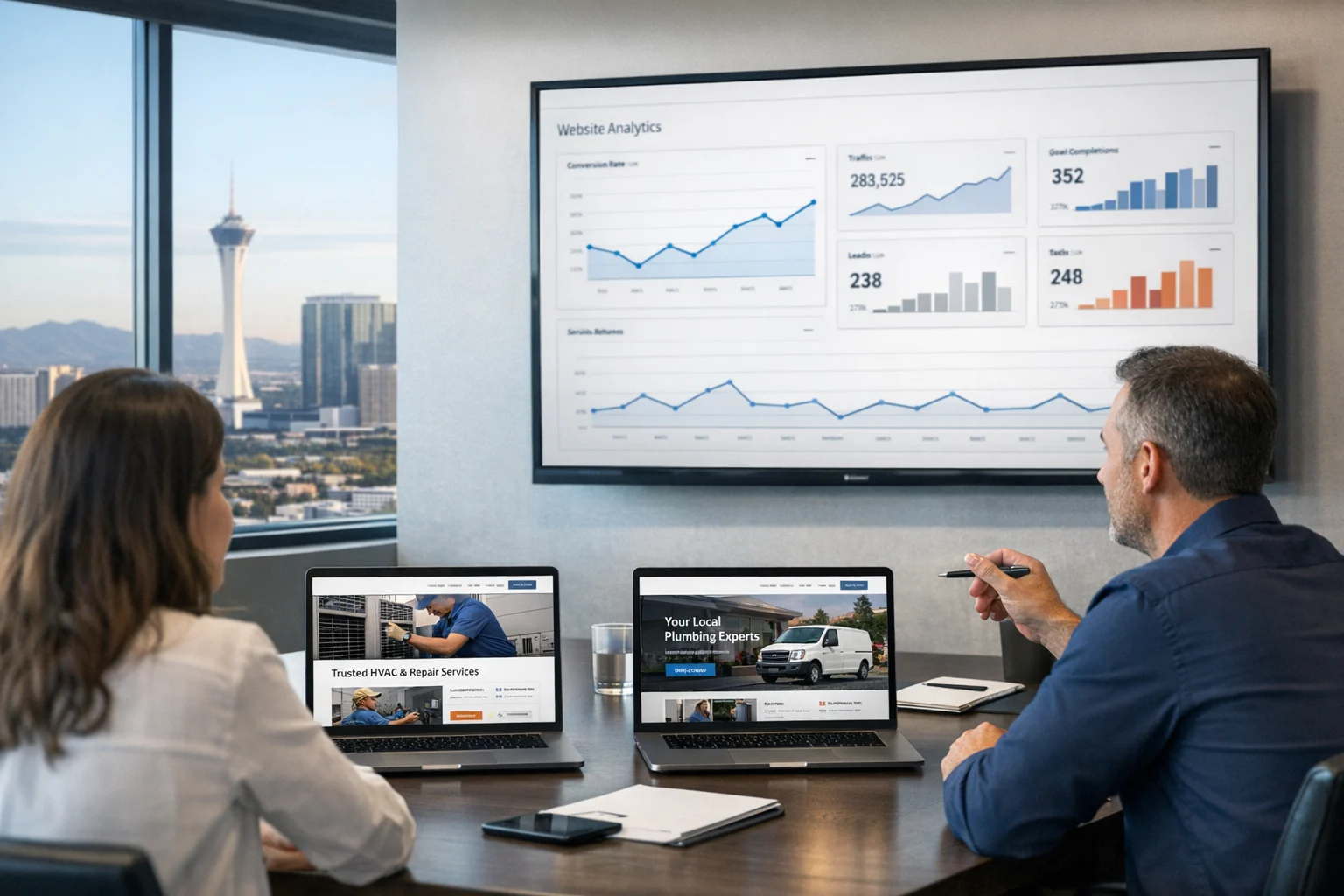
At SiteLiftMedia, we see this across industries, from local service companies in Nevada to multi-location brands with nationwide reach. A website that frustrates users with weak contrast, unclear forms, inaccessible navigation, or video without captions quietly loses leads every day. That loss gets even more expensive when you factor in paid traffic, social media marketing campaigns, and the SEO work required to attract visitors in the first place.
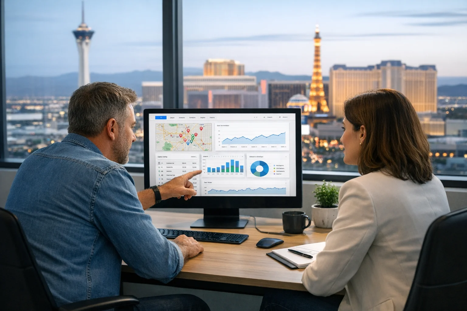
For Las Vegas businesses, the stakes can be even higher. Competitive markets like hospitality, legal, healthcare, real estate, and home services depend on websites that convert quickly on mobile and desktop. If you're investing in Las Vegas SEO, web design Las Vegas services, or local SEO Las Vegas campaigns, accessibility directly affects how many visitors become actual customers. The brands winning right now are not treating accessibility as a bolt-on project. They're building it into design, content, development, maintenance, and security from day one.
Accessibility is becoming a user experience standard
The biggest trend shaping better user experiences is simple: accessibility is now being treated as core UX. That changes how websites are planned. Instead of asking whether a site passes a few technical checks right before launch, smart teams are asking better questions early. Can someone use this menu with a keyboard? Will a visitor understand this form error message? Is the text readable on a bright phone screen in a parking lot? Does this motion effect make the page harder to use?
That shift matters because truly accessible design usually leads to better design for everyone. Clear headings help users scan faster. Larger tap targets reduce mobile frustration. Better form labels improve completion rates. Logical page structure helps both people and search engines understand content. A website doesn't have to look dull to be accessible either. In many cases, accessible interfaces feel more polished because they remove friction.
Businesses comparing agencies should pay attention here. If you're talking to a SEO company Las Vegas brands commonly shortlist, or a custom web design team anywhere in the country, ask how accessibility is handled during planning and QA. If the answer sounds like a plugin and a quick scan, that should raise concerns.
Design systems are replacing one off accessibility fixes
Another major shift is the move toward accessible design systems. Rather than fixing the same issue page by page, teams are creating reusable components that already meet accessibility expectations. That includes buttons with clear focus states, menus that work on keyboard and touch devices, form fields with proper labels, and modal windows that don't trap users or confuse screen readers.
This is especially important for growing companies that need consistency across landing pages, service pages, blog content, and lead generation funnels. A design system keeps accessibility from becoming random. It also speeds up future updates, which is a major advantage when marketing teams are launching promotions, seasonal campaigns, or Q4 offers under tight deadlines.
We often recommend this approach for businesses investing in custom web design because it protects long-term site quality. A polished homepage alone won't carry the load if the booking page, quote form, or location pages create friction. A consistent component library solves that. It also makes website maintenance more efficient because your team isn't reinventing UI decisions every time content changes.
If you want a practical starting point, this guide to practical accessibility fixes covers the kinds of issues that repeatedly show up on modern business websites.
Keyboard navigation and motion control are getting more attention
For years, accessibility discussions focused heavily on color contrast and alt text. Those still matter, but current user experience trends are pushing deeper into interaction design. Keyboard navigation is a good example. Plenty of websites still look fine at first glance yet become frustrating when someone tries to move through menus, forms, popups, and filters without a mouse.
That problem isn't limited to screen reader users. Power users, people with motor limitations, users on adaptive devices, and even busy professionals moving quickly through a site benefit from stronger keyboard access. When focus indicators are clear and page structure is predictable, the experience feels smoother for everyone.
Motion sensitivity is another area finally getting overdue attention. Animated transitions, parallax scrolling, autoplay sliders, and video backgrounds can make sites feel flashy, but they can also create confusion or discomfort. Businesses are starting to use animation more intentionally. Instead of decorating every section with movement, they're reserving it for moments where it genuinely helps guide attention.
This is showing up strongly in higher-quality web design Las Vegas projects because flashy visuals alone no longer impress users the way they once did. Visitors care more about clarity, speed, and trust. That's one reason the broader conversation around dark mode and modern web design trends now overlaps with accessibility much more than it used to. Adaptable interfaces need to work for real people, not just look modern in a mockup.
Readable content is now part of technical performance
Accessibility trends are also reshaping how businesses think about content itself. Readability is no longer separate from technical SEO and conversion work. If a service page uses tiny text, poor spacing, vague headings, and walls of jargon, users leave. Search engines pick up those engagement signals. Sales teams then feel the effect when fewer visitors turn into qualified leads.
The strongest websites now use content structure as a usability tool. That means descriptive headings, shorter paragraphs, meaningful link text, bullet points where they help, and language that explains rather than obscures. It doesn't mean oversimplifying expertise. It means presenting that expertise in a format people can actually use.
We regularly see gains from improving readability on local landing pages, service pages, and blog content. This is particularly important for businesses targeting local intent in Nevada. A law firm, medical practice, contractor, or ecommerce company trying to improve Las Vegas SEO can lose traction if important content is hard to parse on mobile. Accessibility and technical SEO often meet in the same places: semantic HTML, crawlable structure, image optimization, page speed, and clean hierarchy.
If your site already has traffic but struggles to convert, this is worth looking at before throwing more money into backlink building services or paid campaigns. Traffic helps, but it can't compensate for a page people don't trust or can't use comfortably.
Forms, booking flows, and checkout paths are under the microscope
One of the most commercially important accessibility trends is the renewed focus on forms. Contact forms, appointment schedulers, quote tools, checkouts, and application portals are still some of the most common failure points on business websites. We've audited sites where the design looked excellent, the traffic numbers looked healthy, and conversion rates still lagged because form UX was getting in the way.
Accessible forms do a few things well. They clearly label every field. They explain required inputs before a user makes a mistake. They provide useful error messages that say what went wrong and how to fix it. They don't rely on color alone to communicate problems. They support keyboard navigation, screen readers, autofill, and mobile input patterns.
This matters across nearly every industry. A hotel inquiry form in Las Vegas, a medical intake form, a legal consultation request, or a home service quote builder all need the same thing: less friction. The more steps involved, the more critical accessibility becomes. If a user is already comparing multiple businesses, any confusion inside the form can send them to a competitor in seconds.
For marketing managers, there's a straightforward takeaway here. When social media marketing or PPC campaigns are driving traffic to lead capture pages, accessible form UX protects ad spend. For business owners, it protects revenue. Those improvements are usually measurable very quickly.
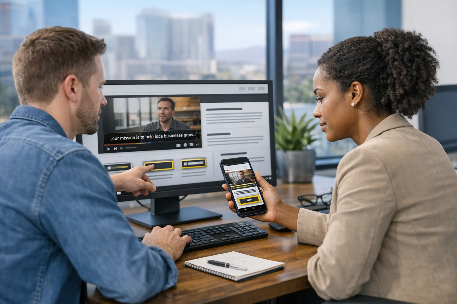
Media accessibility is becoming a brand trust issue
Video, audio, product imagery, and interactive media are now standard on business websites, which means media accessibility is no longer optional. Captions, transcripts, descriptive alt text, and sensible media controls all shape whether content is usable in the real world. A visitor may be in a waiting room, on a noisy trade show floor, or browsing with sound off during work hours. Captions don't just support accessibility. They support reality.
Alt text is evolving too. Businesses are getting better at writing image descriptions that are useful instead of stuffing keywords into them. That helps assistive technology users and supports search visibility when handled properly. The same principle applies to charts, infographics, and product visuals. If the key information only exists visually, a portion of your audience is left out.
This is where brand perception enters the picture. A company that says it values customer experience but publishes inaccessible video content or image-heavy pages with no meaningful descriptions sends the wrong signal. In competitive local markets, trust details add up fast. That's part of why accessible media can support both conversions and accessibility driven SEO gains in Las Vegas.
AI can speed audits, but human testing still matters
AI-powered tools are helping agencies and internal teams detect accessibility issues faster. Automated scans can catch missing alt text, contrast failures, unlabeled form fields, duplicate IDs, empty links, and other common problems at scale. That makes ongoing monitoring far more practical than it was a few years ago.
Still, one of the most important developments in this space is the recognition that automation has limits. A tool can tell you a button is present. It can't always tell you whether the button label makes sense in context. It can flag a missing form association. It can't fully judge whether the form flow is intuitive or whether an error message helps a real person recover.
That's why the best accessibility workflows combine scanning with hands-on QA. At SiteLiftMedia, that usually means keyboard testing, screen reader review where needed, mobile checks, form submission testing, and a close look at templates that drive the most traffic or revenue. For businesses with multiple departments and content contributors, this also means governance. Teams need standards so new blog posts, landing pages, PDFs, and promotional assets don't introduce the same problems again.
This is especially relevant for brands preparing for seasonal traffic spikes. Q4 planning, holiday traffic readiness, and campaign launches can expose weaknesses fast. Accessibility issues that feel minor during a slow week become costly when traffic ramps up and users are moving quickly.
Accessibility is converging with security, maintenance, and uptime
Another change worth watching is how accessibility now overlaps with broader site health. An accessible website still has to load reliably, stay secure, and work under traffic pressure. Broken scripts, expired plugins, misconfigured caching, and vulnerable third-party tools can all undermine usability in ways that directly affect people trying to complete tasks.
That is why accessibility work increasingly sits alongside website maintenance, technical SEO, and cybersecurity services instead of living in a separate silo. If a form breaks after an update, that is both a UX and accessibility problem. If a popup created by a third-party tool blocks keyboard access, that is both a marketing stack issue and a usability issue. If poor hosting setup causes downtime during a campaign, the user experience is gone before it even begins.
For larger businesses or organizations handling sensitive user data, the connection runs deeper. Penetration testing, server hardening, system administration, and business website security all support trust. When users are filling out forms, logging into portals, or completing purchases, they need both accessible interactions and confidence that the platform is stable and secure. These are not separate conversations anymore.
We've also seen accessibility concerns surface during redesigns where security plugins, cookie banners, chat widgets, or booking tools were added without enough QA. If you're reviewing vendors, ask how they test accessibility after updates, not just at launch. That's one reason ongoing support matters as much as initial design.
Businesses tracking the broader digital risk landscape may also want to watch the trends discussed in current cybersecurity trends affecting websites, since stability and trust have become inseparable from user experience.
What business leaders should prioritize next
If you manage a website that supports lead generation, bookings, ecommerce, recruiting, or customer support, the best next move is not guessing. Audit what your users actually experience. Look at the paths that matter most and test them hard.
- Review navigation: Can users reach every major section with a keyboard and clear focus states?
- Check contrast and readability: Are service pages comfortable to read on mobile in bright environments?
- Test forms: Do labels, instructions, and error messages help users complete tasks without frustration?
- Assess media: Are captions, transcripts, alt text, and controls in place where needed?
- Inspect templates: Blog posts, location pages, and landing pages often carry repeated issues site-wide.
- Coordinate teams: Design, development, SEO, content, and security need shared standards.
- Prepare for traffic spikes: Before Q4 or seasonal promotions, make sure performance tuning and accessibility QA happen together.
For Las Vegas companies, this matters even more because search competition is tight and user expectations are high. No amount of local SEO Las Vegas strategy, paid traffic, or reputation management can fully make up for a site that creates friction at the moment a visitor is ready to act. The same goes for nationwide brands with location-specific campaigns. The cleaner the experience, the more efficiently your marketing budget works.
SiteLiftMedia helps businesses connect accessibility with real growth outcomes, from custom web design and technical SEO to website maintenance, security readiness, and conversion-focused updates. If your team wants a practical accessibility review before the next campaign push, reach out to SiteLiftMedia and we'll show you where your website is helping users and where it's quietly costing you leads.
Photo Gallery